Wednesday, 30 August 2017

Spring Blooms


Hello, planner friends!

Every month I have an absolute ball playing with Anna's designs and this month was no exception. The August sticker kit club was themed 'Cats in Bloom' and that meant it was perfect for a Spring-themed layout. Here in Australia, we're about to hit Spring (and not a moment too soon - it's been pretty cold recently) and the bloom stickers were a perfect match for what I wanted to achieve.


All of the washi tape I used I pulled from my collection (which is going on about 5 years old now) and I tried to find some colours that would contrast with the beautiful watercolours.
I love how it turned out.

I hope that it inspires you to have fun with your monthly layouts - even in your personal size planners - and add a bit of colour.

As always, you can come chat to me on social media by following me on Instagram or Youtube.

Until next time, happy planning!

Stef xx

Tuesday, 29 August 2017

Inky Flowers Speed Paint

Here is a speed paint process of a piece I created for my Patreons collage sheet (plus one Patreon who got the original!) Thank you to my Patreons for supporting my work and making sharing on YouTube possible!


Become a Patron!

Monday, 28 August 2017

Beachin' Time


Now I'm not really one for Summer but I do have a real love for all things beach and ice cream *insert childish excitement here*. You can keep the hot weather though! So I was rather pleased when Anna shared August's Patreon content and collage sheets.

I had on the reverse of one of my pages watercolour swatches I'd made in attempt to create a skin tone for my vintage girls from last months patreon content and I was undecided as to whether I was going to a)leave them and move onto another page b) gesso over them or c) include them somehow in the next piece I created. I figured they looked enough like sand so I thought I'd just roll with it and I'm quite happy with how it turned out. I added a couple of bits from the collage sheets - cannot go wrong with some ice cream or flip-flops. I love the simplicity of it, I'm usually one for adding faaaar too much to a page and I'm quite pleased with my self restraint!


....having said that....this is the bit I'm not sure about, having added the sea water I'm not convinced. Part of me wishes I had left it as it was whilst the other half of me quite likes it. What do you guys think?


It's funny how sometimes you start creating and it just sort of snow balls and you end up being inspired by something you've done and going on to create something else which in turn inspires another idea. That is what happened to me, there is just so much Anna shares and there's so many ways in which to use them!

When I was younger, whenever we went passed rows of houses on our travels I'd try and imagine all the lives behind the front doors. Imagining the comings and goings of the occupants, happy tales full great big adventures, with monsters and fantastic beasts - I had an uncontainable imagination. Nowadays I still dream and concoct stories, whole lives mapped out within single moment, although they are somewhat tamer than my childhood self would have created and the future of these imaginary people isn't based on the colour choice of their door or curtains. Anna's houses reminded me of this, I think it was the combination of the stylised way in which Anna has drawn them and the residual feelings of excitement over beaches and holidays away at the seaside. 

I decided I wanted to continue this feel by abandoning my perfectionist self in search of my inner child - which was not hard, she bounces around just beneath the surface waiting to be set free! I used my craft knife and carefully cut around the houses leaving a small amount a the side to use as a tab so I could lift them back to reveal the inside.


I went right back to basics with felt tips with a bit of watercolour thrown in. I happily scribbled away with my felt tips, even encountering the same problems of some colours starting to dry up and then just scribbling harder to make the colour transfer. 


I wasn't sure how I'd convey the life events of these fictional characters and dithered about a bit before settling on simple symbols. Ironically if you read it from right to left it tells a rather morbid tale and one I hadn't intended!


I really enjoyed the 'letting go' aspect of this page, there is something to be said for not worrying about placement or realism and drawing and colouring outside of the lines.

Here's where it gets all a bit planner-creative-desk inceptionesk! I absolutely love this collage piece and immediately felt drawn to it...I think it has something to do with the fact it resembles my desk 99% of the time. Rather unimaginatively I decided to recreate my surroundings.


First I began Gessoing the areas I wanted to add more detail, mostly to try and block out some of the collage sheet. I think perhaps next time I won't take the easy route and I'll cut into where I'm going to build upon.


I built up the planner page by adding several sheets of normal copier paper and offset them slightly to give the appearance of volume as it was looking a little flat. I tried to set the page up similar to one of my journals so I printed off a photo and placed some ephemera and used some of the other collage pieces to create some washi tape. When I'm working on a journal page I also like to have the bits of ephemera around me so I've also included a mini pile next to the page. 


I almost always have a cup of something at the desk with me too, so I used a bit of watercolour over the gesso. I quite like using gesso and watercolour in this way, although there isn't a great deal of blendability you do get some interesting textures as the water is not absorbed by the paper. I tried to recreate some bubbling but I became impatient and it didn't quite work! 


I also added some more paint splodges, if I'm honest that bit happened by accident, but it was a happy one so I just added some more and I think it ties in nicely. Lastly I added a quick 'To Do' I always have a couple of these floating around my desk, and inevitably they always become buried under a mountain of my stuff. 

I really loved letting go and just getting stuck in with this months collage sheets. I immersed myself in the process and forgot about the rules, and produced some pieces very unlike my usual style! But that is what I am loving so much about Anna's patreon, it really is pushing my boundaries and expanding my creative thinking. 

I've been enjoying the sketchy girls you've all been sharing! Cannot wait to see how they develop and come together :)


Till next time guys xx 

You can also find me on Instagram and over on my blog

Sunday, 27 August 2017

Abstract Artworks


Hello Brimblers!

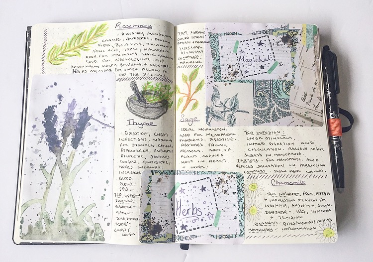
 This month I've been working with the collage sheets available from Anna's Patreon. I decided to work with the more abstract artworks. I love the variety created by Anna, the colours used and how they inspired me. Firstly I decided to work with the collage paper style sheet. I've been drawn to a lot of vintage papers this Summer and this drew me in. I wasn't sure what I wanted to do at first so a lot of the time I had it sat on my desk waiting for it's purpose. Then the day came! I've been working with Herbs recently, something I've done in the past and am now revisiting. This artwork matched my plans and colour scheme perfectly. It began with the lavender image and went from there. I loved the blank space amongst the paper collage, it made for a natural title area.

  FullSizeRender (38)

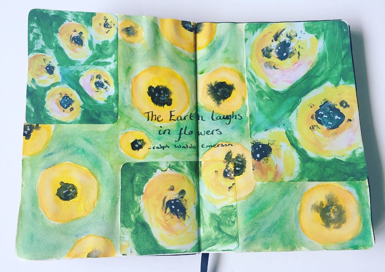
I then played with three of Anna's mixed media abstract work. Firstly I went for the yellow flowers. I love how this looks already and wanted to create an extension of it. The artwork looks as though it has been created with Acrylics. I wanted to try a different media against it to see the effect. I decided on watercolour, ending with a result of Anna's deliberate brush strokes and art that looks good enough to touch, against my softer approach with gentle blending. I ended it with a quote as I felt it needed a little something.
  FullSizeRender (37).jpg

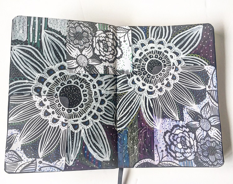
The last page I created featured two of Anna's abstract works. The first being white flowers and mark making with purples in the background. The second being similar with hints of green. Again I wanted to extend the artwork as I felt it was already lovely in the way it looked. I decided to stick these onto black paper and used a mixture of chalk pens, white gel pen, black fine tip pens and metallic pencils to gain the look I was after. Of the three created, this is my favourite. I found it extremely peaceful working on this, I've never created any Zentangles before but I get the impression that this is the point of them. A sort of doodling to create an image and unwind your mind.

  FullSizeRender (36)

So that's what I've been up to with Anna's Patreon artwork this month, check out the link here. 

Thanks for stopping by, Kelly

Tuesday, 22 August 2017

Journal & Paint with me - Creative Girl

I recently purchased a book - Paint Yourself Calm and I thought I would do a review of it which hopefully you would have already seen. If you missed it you can find my review here.

I thought it would be fun to try and take on board some of the exercises in the book and try and recreate something. So in this video I do just that, I paint a page and turn it more into a journal spread so come take a look! If you are interested in the book I mentioned here is the link for it (Please note the link is an affiliate link, you don't pay any more for the book but I do get a very small % from it. You don't have to use this link but I very much appreciate it if you do):


PLEASE NOTE: I PURCHASED this / these product(s) with my own money. The author or publisher did not know that I was doing a review. This review is my own personal opionion on the product / company, given in good faith and has not be sponsored or endorsed. Unless otherwise stated, all photography is my own.


Sunday, 20 August 2017

Grace's Cat Journaling and Planner Projects


As a cat person, who also loves florals, this kit was pretty much perfect for me. So I wanted to create quite a few projects with it.  


The first was a 'scrashbook' page, one of my (many!) forms of creative journaling that incorporates styles of scrapbooking, smashbooking, art, and creative journaling. I chose some photos of my cat, Conan, in the garden and journalled about how much he loves to be outside.
I added colour to the page by dabbing some pink acrylic paint on with a foam brush, then I journalled on the back of the card and attached  it to the page with some paw print washi. Then it was sticker time! Here are some close ups:


I used this paper from the Brimbles shop for my background, as well as a journaling card from a cat kit which is sadly no longer available. 


I just LOVE layering stickers in little clusters!  Here is the finished layout, there is also a process video for this if you'd like to watch.


As for my other projects, I did a planner spread, of which you can watch the plan with me video here


Then I created a page marker for my planner. I did use my silhouette cutting machine to make the page marker, which I appreciate not everyone has, but you could easily make something like this on your computer and fussy cut it, or simply attach alpha stickers to the top of some card and laminate it. 


And my last little project, because I only had one decorative floral sticker left, was to make a mini divider/tip in for my planner for the section where I keep track of my cat's important details and information. 


On this one I dabbed some black ink (just using my fingertips) onto on of the cat stickers so they'd contrast (also Conan is a black cat!).

And that's it! And after all that I still have a handful of stickers left to use. Thanks so much for reading and catch you all next month <3 span="">


Grace <3 span="">
@ms.paperlover


Wednesday, 16 August 2017

Jennifer's Planner Pages


Hi planner people!

I hope everything is going well in your plannerverse. It's certainly been busy in mine. All the more reason to make sure my planner game is on point. This week has been easier than most as I get to use this great kit from Anna (Mrs Brimbles). 


Tuesday, 15 August 2017

Creative Girl - Book Review

I recently purchased a book - Creative Girls and I thought I would do a review of it. If you are interested in the book I mentioned here is the link for it (Please note the link is an affiliate link, you don't pay any more for the book but I do get a very small % from it. You don't have to use this link but I very much appreciate it if you do):


PLEASE NOTE: I PURCHASED this / these product(s) with my own money. The author or publisher did not know that I was doing a review. This review is my own personal opionion on the product / company, given in good faith and has not be sponsored or endorsed. Unless otherwise stated, all photography is my own.


Saturday, 12 August 2017

Collaging with Steph


Hiya folks!

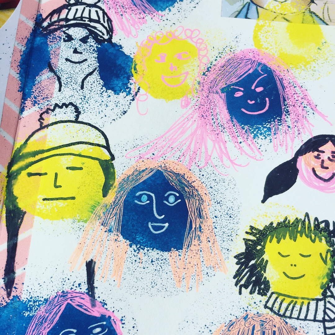
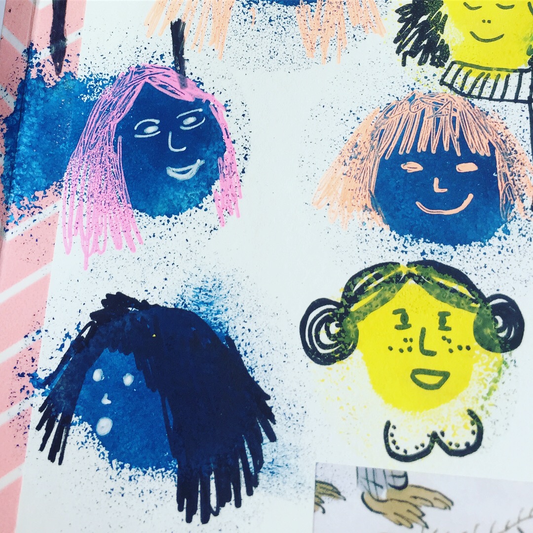
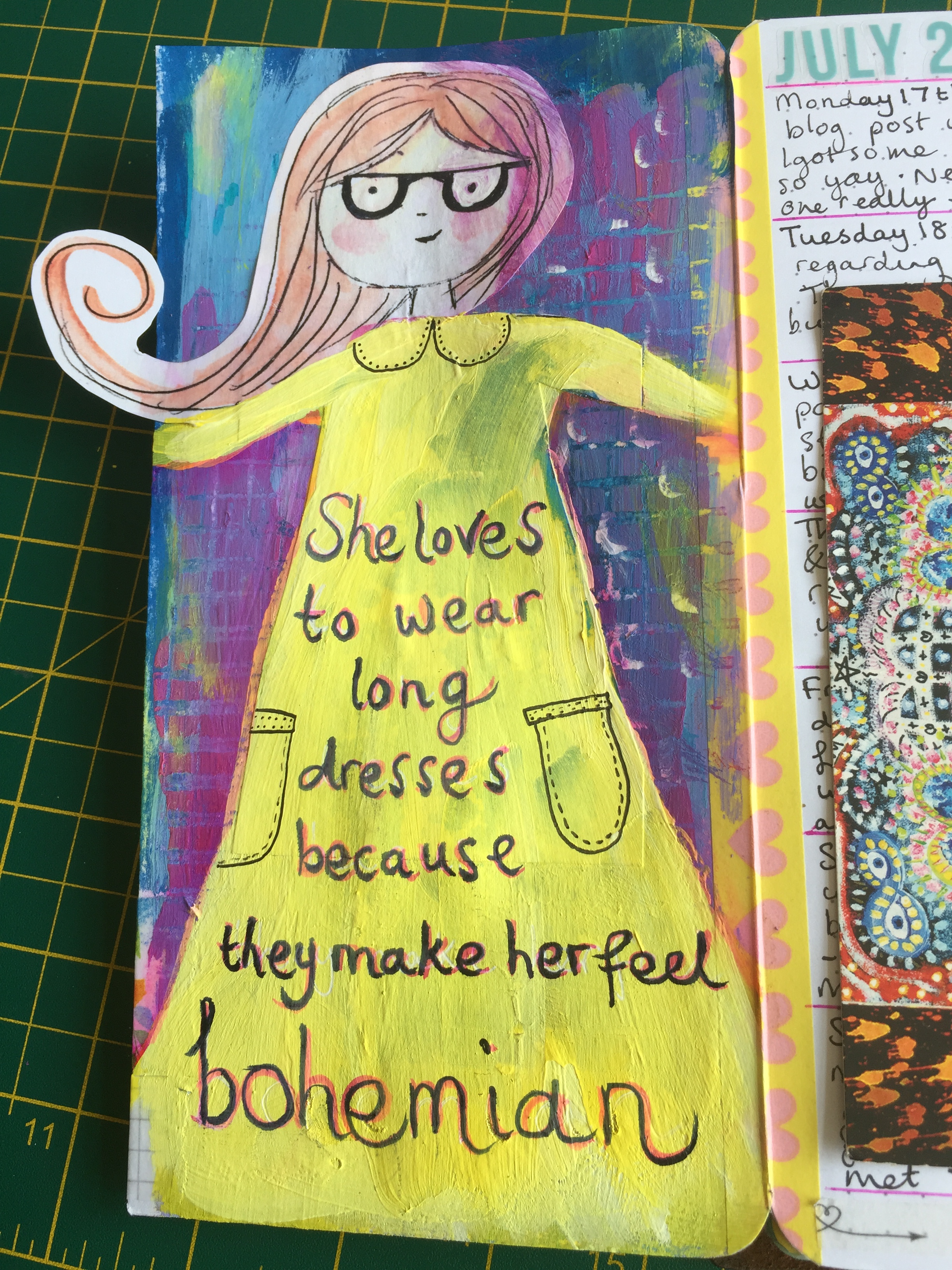
 This month Anna shows us, her patrons, how to give our sketchy girls their individual facial expressions. She makes it look so easy as, before our very eyes, a variety of characters take shape and pop out of the page. As usual Anna manages to both inspire and encourage participation. See for yourself and visit the Mrs Brimbles Patreon page here.

IMG_7686I
 have been getting into mixed media art lately and losing myself in the therapeutic layering of backgrounds in my art journals. The other day I was stencilling with a couple of sponge dobbers in a journal - as you do - when I remembered I had some space to fill in my memory keeping traveller's notebook insert. I finished the layer I was working on and switched to the TN where I dobbed some splodges of the remaining acrylic paint I was using into the gaps on the pages. On half of them I absentmindedly doodled little patterns and symbols and then - stopped myself with a new idea - I could turn the remaining splodges into characters! Being a great believer in art as a good mood booster, I thought I would have some fun and not think too much about the end result, so I grabbed a few trusty pens and doodled away using the techniques learned from Anna's workshop. I thoroughly enjoyed this activity and the results are quirky and satisfying, particularly due to the spontaneity.
  IMG_7674
IMG_7675 (1)

In addition to the video content, another beautiful set of digital collage sheets have been made available for us to download and print out as many times as we like. I am feeling thoroughly spoilt as I have only just begun playing with the July pages. Speaking of which, here is my latest creation using one of July's sketchy girls:

  IMG_7619

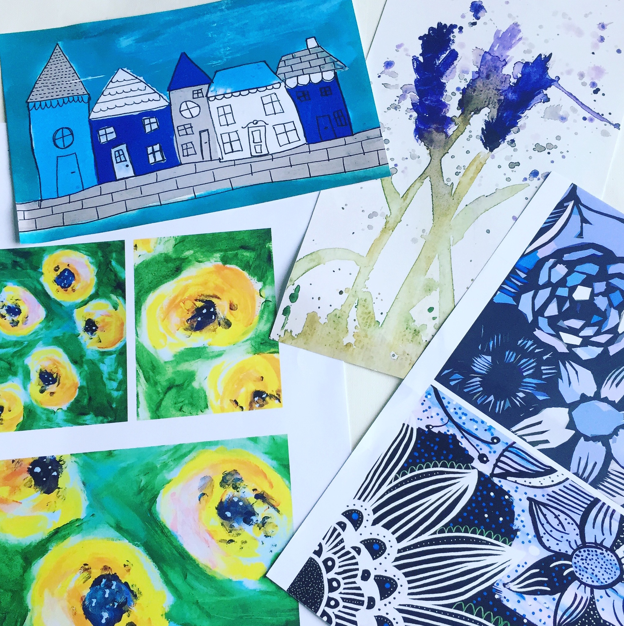
The August images are absolutely stunning and as soon as I saw them on the computer screen I was desperate to get them in my traveller's notebook. I would have loved to be a fly on the wall when Anna was creating these - I’m curious about the inspiration and the process... Anyway, here is a flavour of some of my favourite elements this month:

  IMG_7784

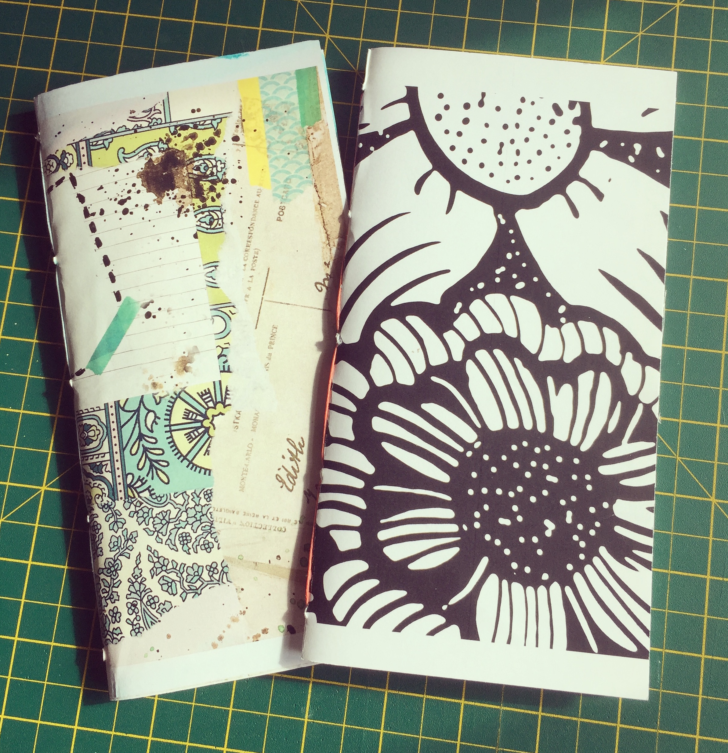
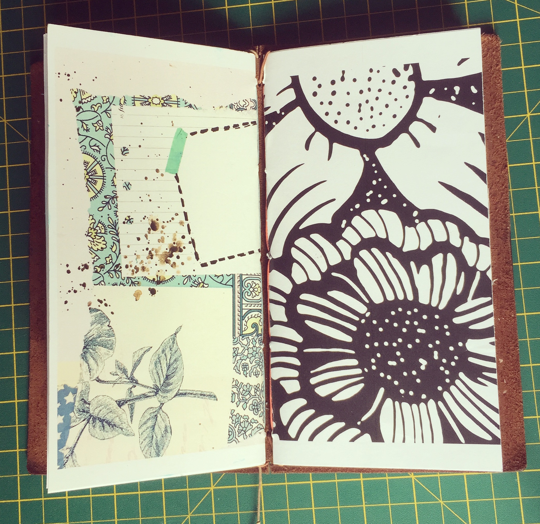
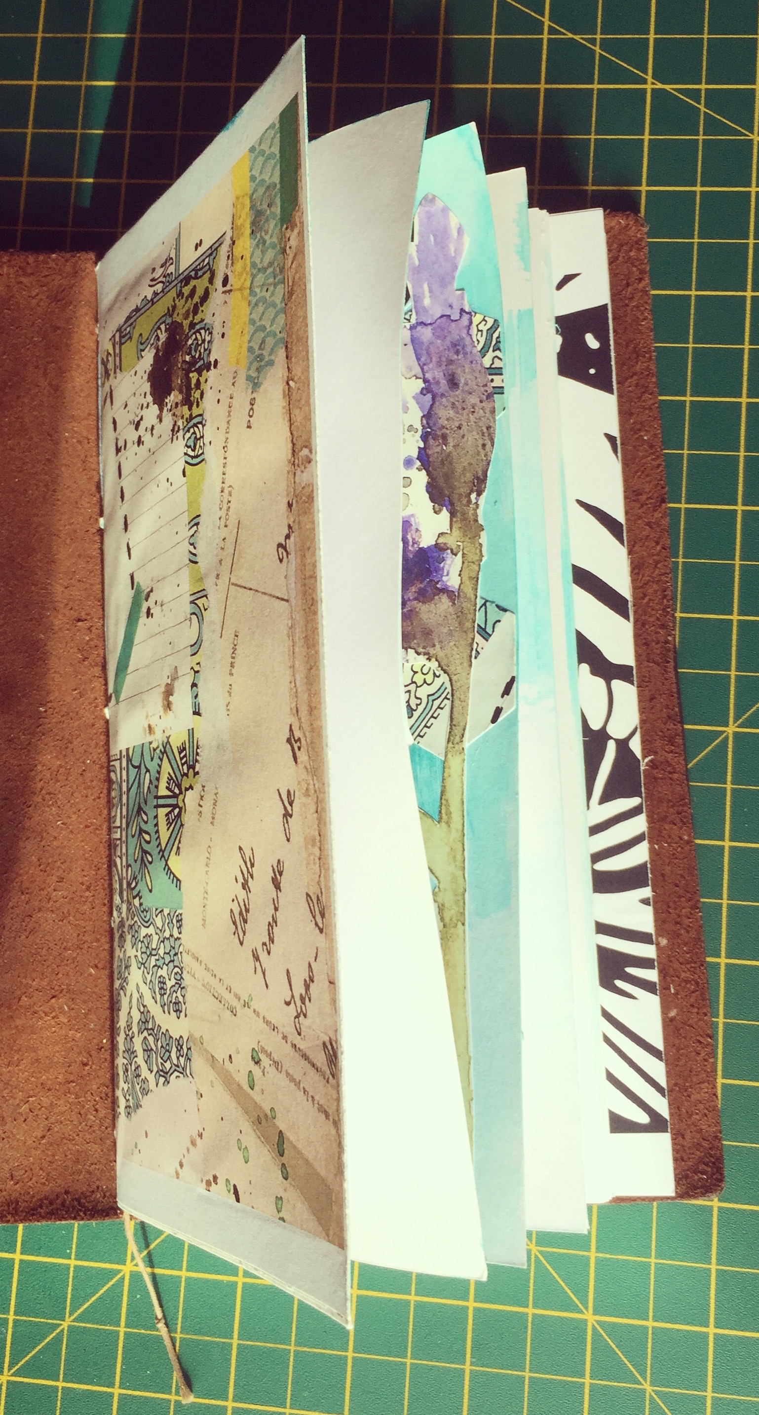
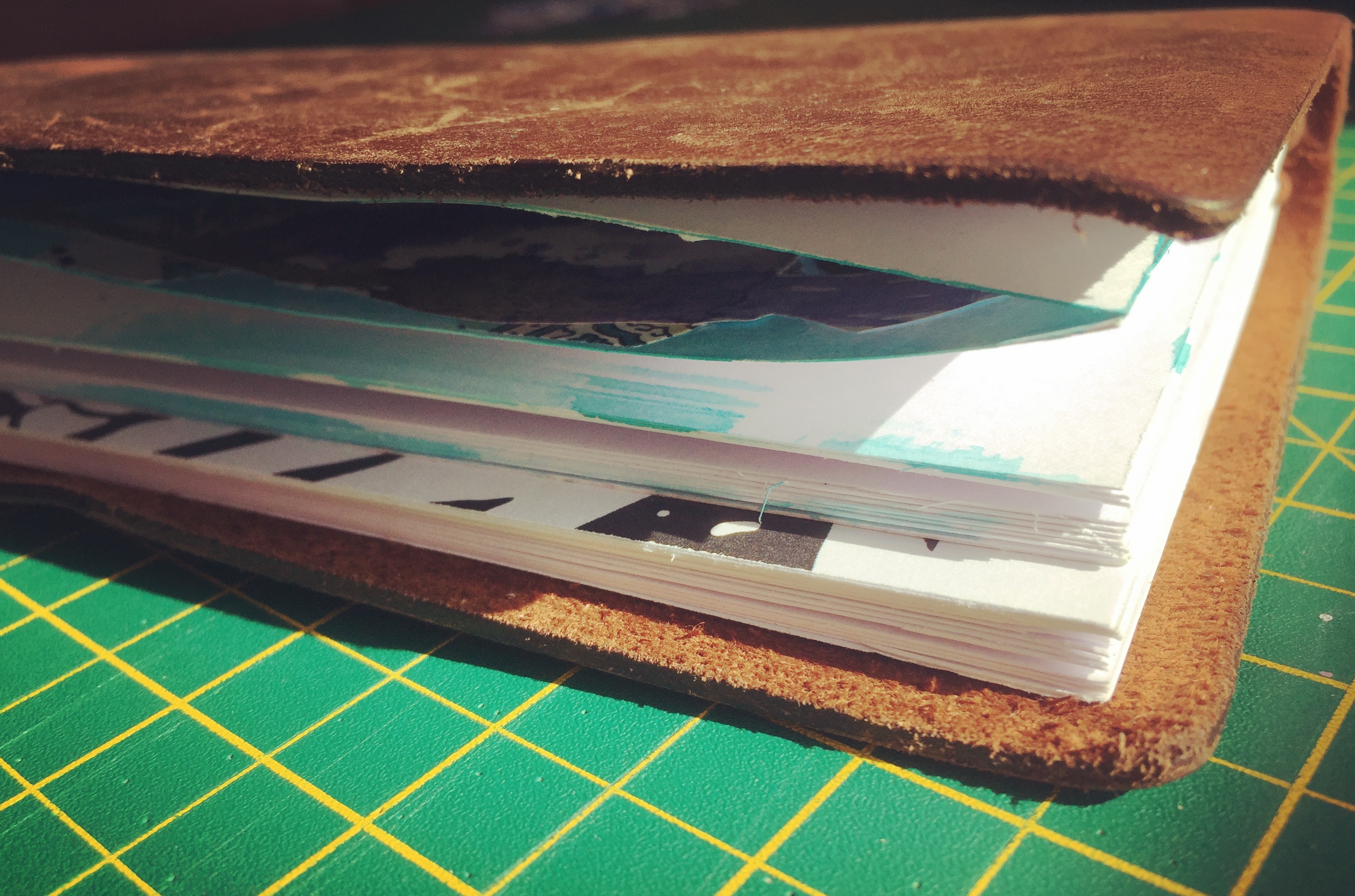
I decided to make a couple of art journal inserts for my regular Midori TN and cover them with two of the absolutely gorgeous collage sheets just as they as they are. Anna's journal page reproduction on the left is dreamy and I love the monochrome floral on the right, contrasted with the pop of the bright coral thread on the spine.

  IMG_7781
IMG_7778

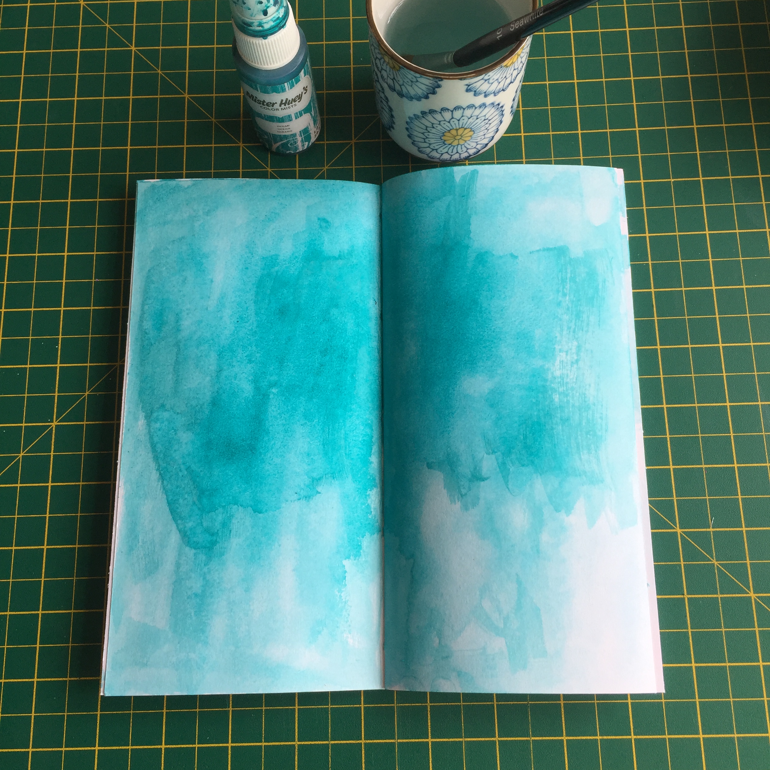
Then I got busy creating inside one of the inserts. First I sprayed some ink and used a wet brush to cover the entire double page spread. I love using this as a base upon which to add paint or collage elements and I am in love with this shade of blue.

  IMG_7762

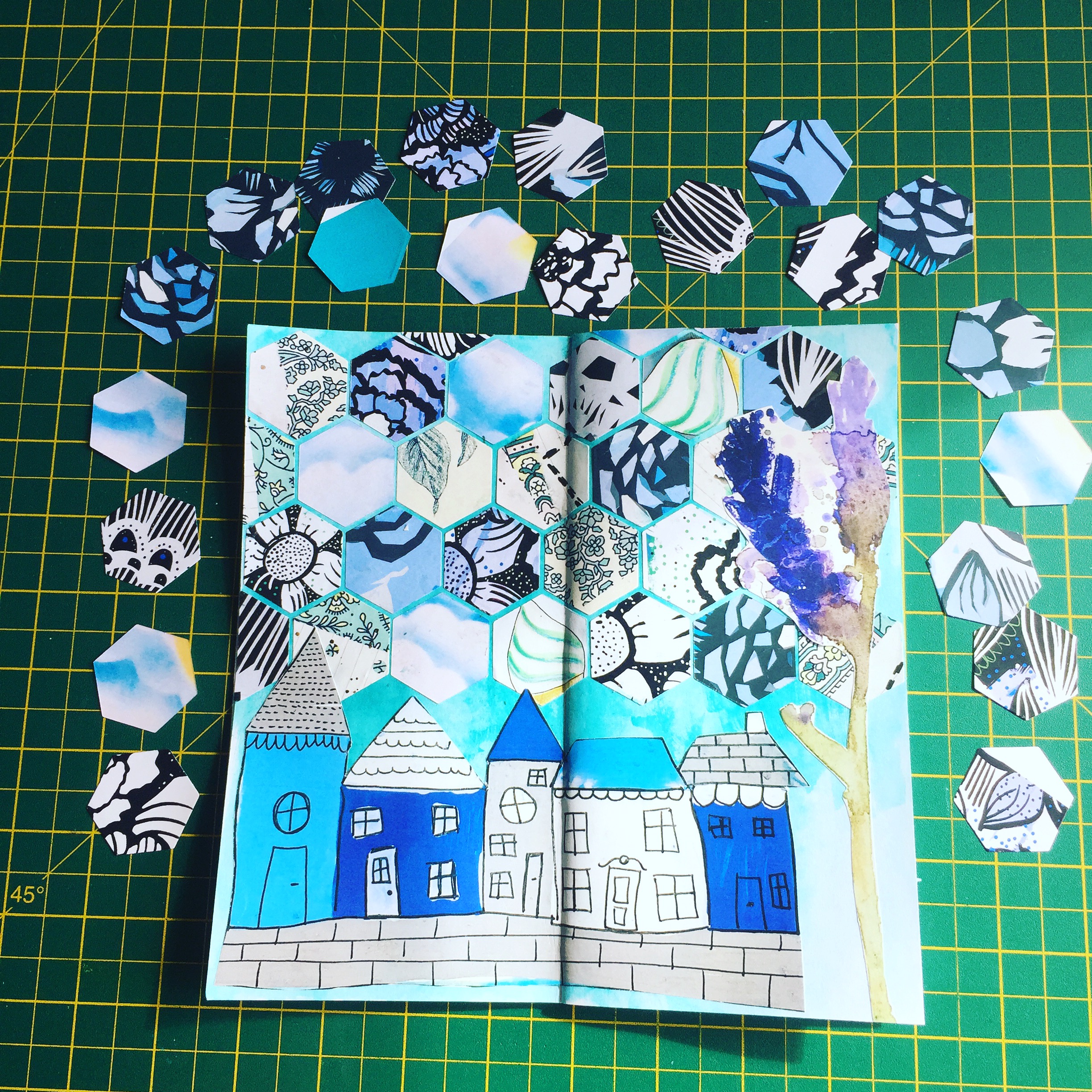
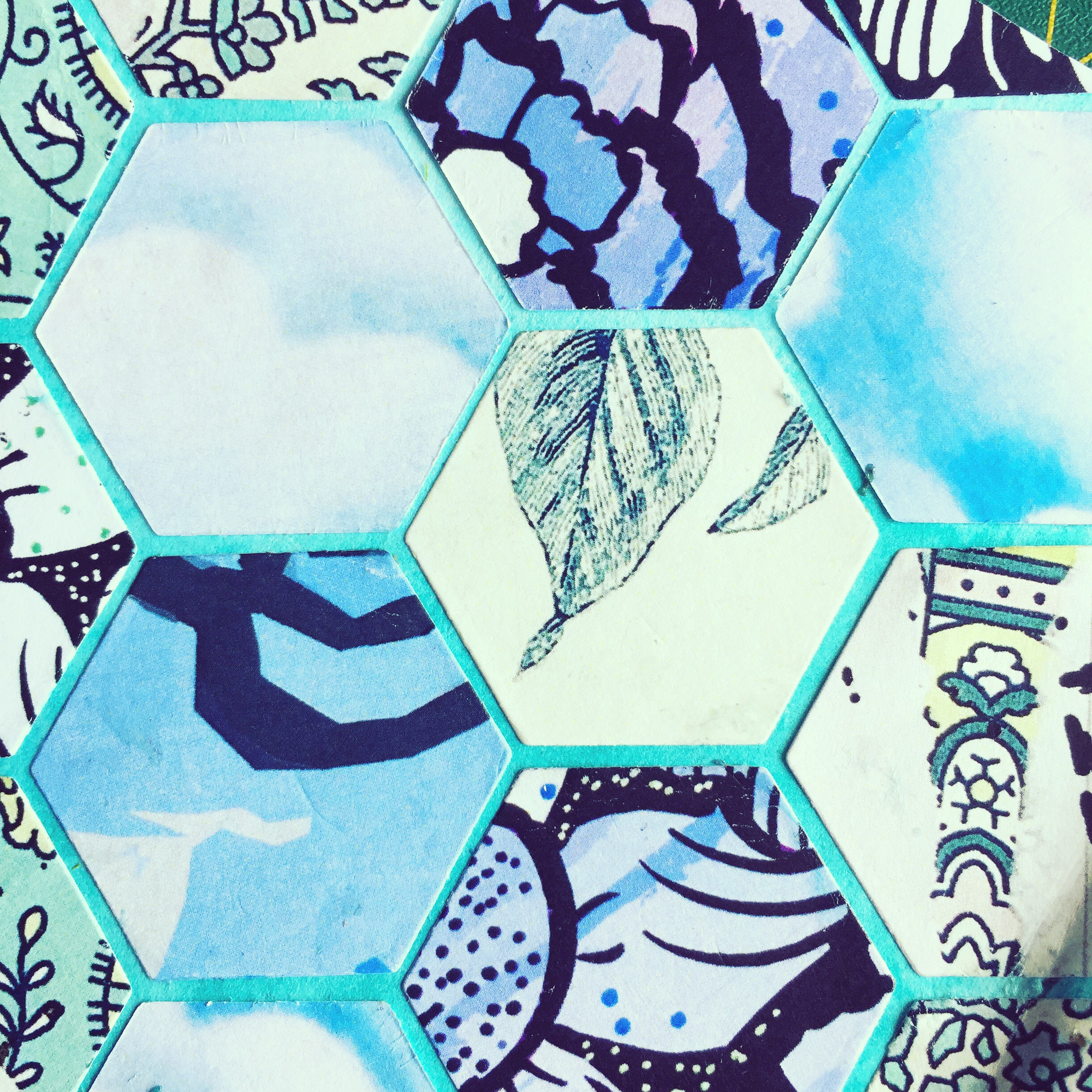
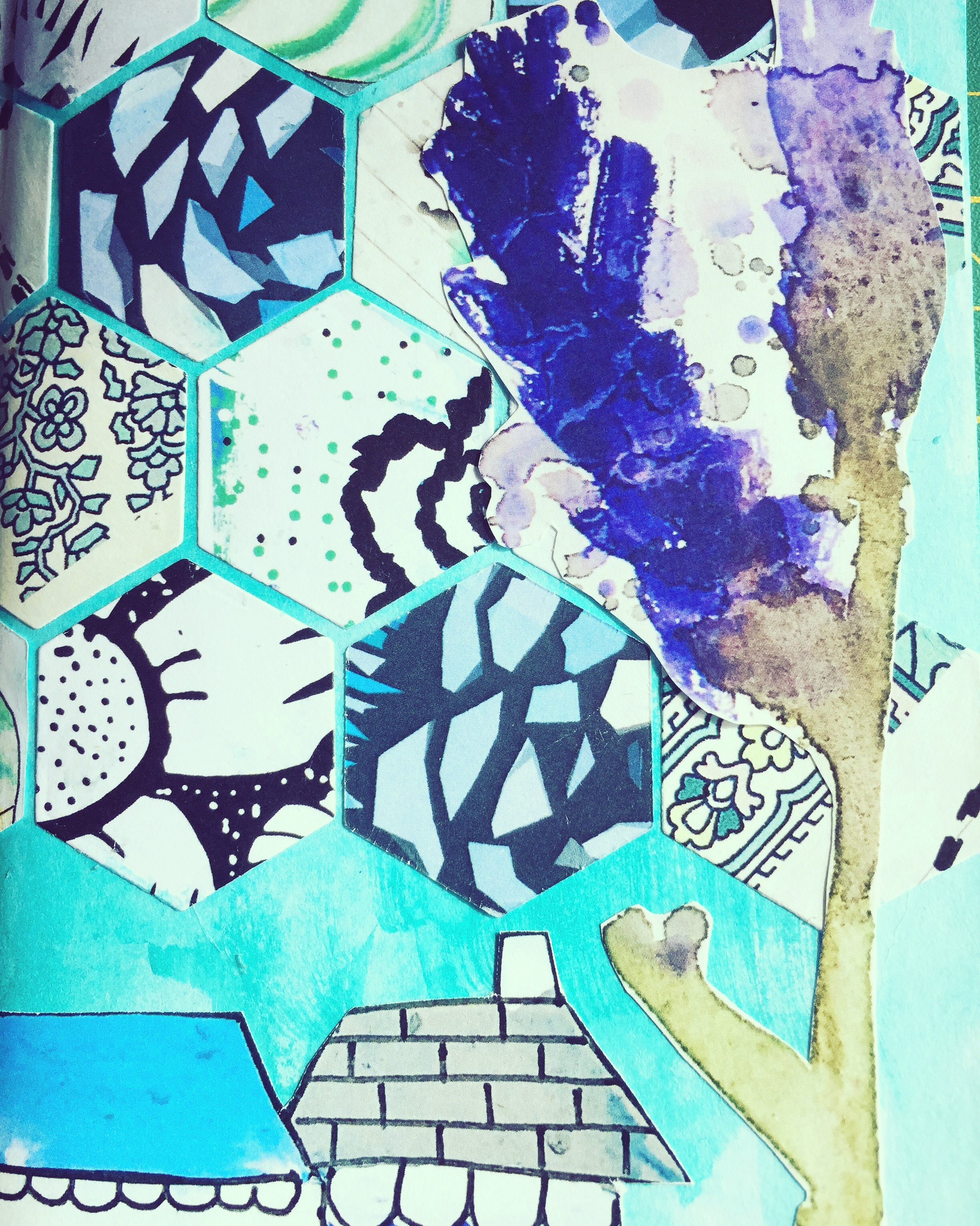
I went on to use my die cutting machine to cut lots of little hexagon shapes from a few different collage sheets. Tessellated hexagons really rock my world and together with the adorable higgledy piggledy buildings and the purple plant, now tree, I am a big fan of how it looks.

  IMG_7768

IMG_7782

IMG_7783

IMG_7779

IMG_7780

Thanks for reading everyone. Until next time... Steph x x x

 Here are links to my Instagram and blog

Friday, 11 August 2017

Stef's monthly spread


Hello, planners!

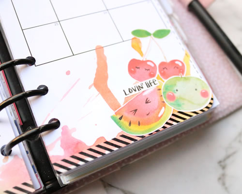
This month I had some fun using up the remainder of my stickers from July in a monthly layout in my planner.

Full confession: I'm pretty bad at using my monthly spread, but I'm trying to get better and often that means that I need to pretty it up so I want to look at it all the time, so this layout really works in my favour. (It's all about tricking the brain!)

Subconsciously, I held off using the cute little lemons in my last layout featuring Anna's stickers because I love lemons. They're my favourite fruit, and so aesthetically and fragrantly pleasing! But I'm trying not to hoard stickers so I had to use them.

It also gave me an opportunity to play with my watercolours on a layout, which I haven't done in ages, and I love how it all turned out.


I hope that you're all having a fabulous week.
Don't forget to stop by my Youtube or Instagram pages to chat all things planners!
Stef
SaveSave