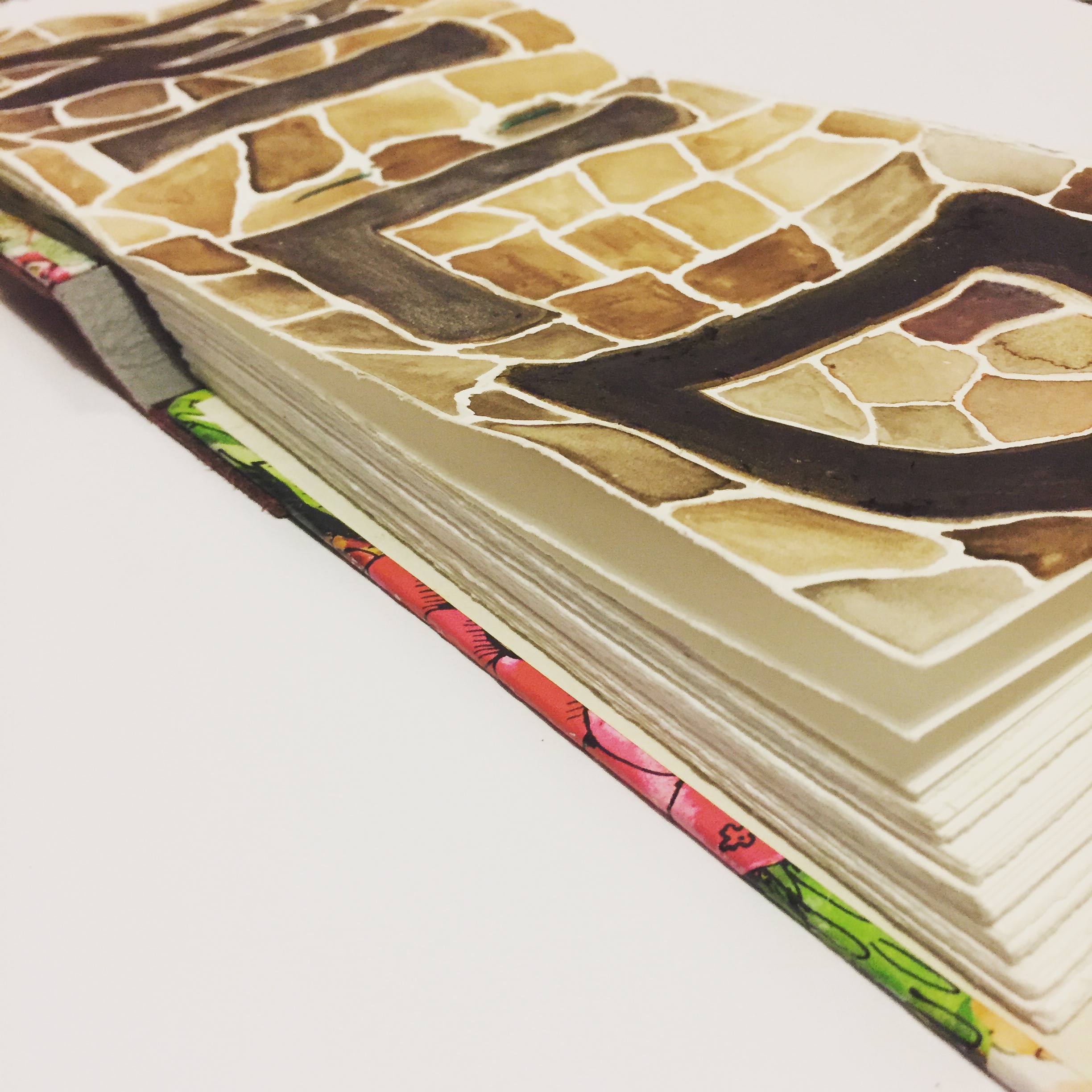
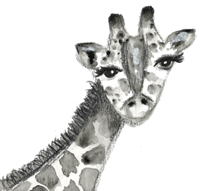
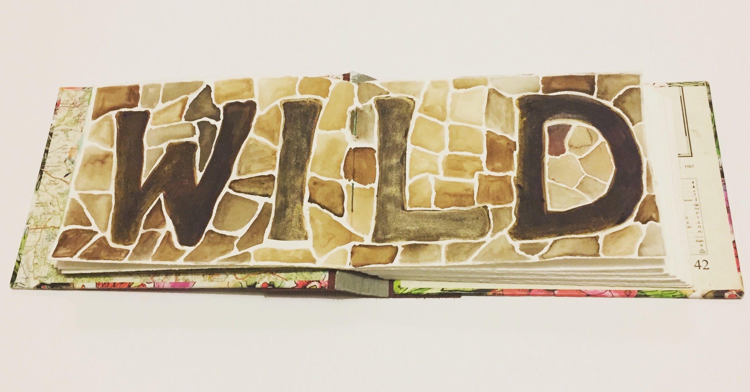
I was itching to display the word in my art journal somehow and Anna Brim's Patreon tutorial on painting a monochrome giraffe inspired me to get out my watercolours and paint a giraffe pattern background. Here is Anna's stunning giraffe:
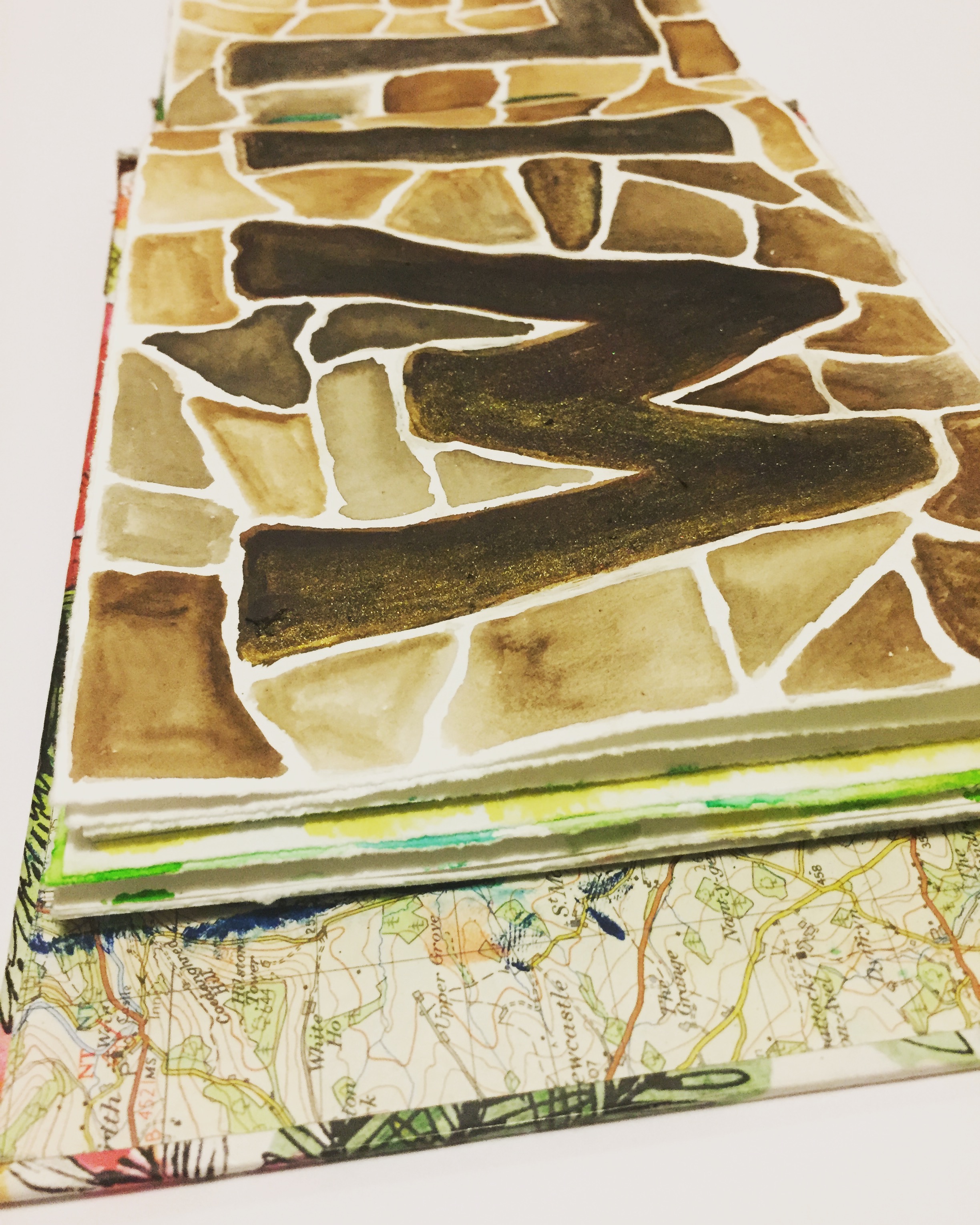
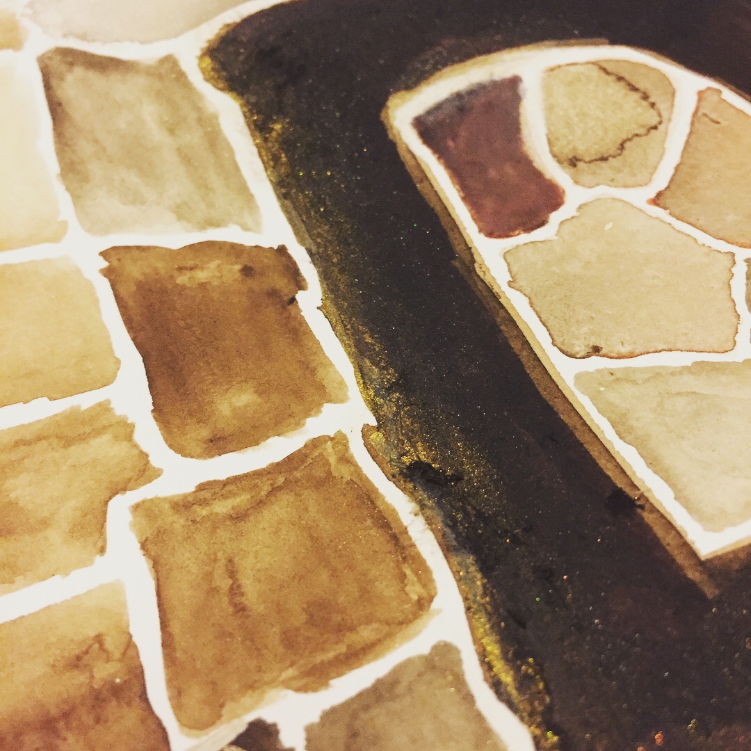
I like the way that my word stands out because of the clean white outlines that are just like the clean white spaces between the brown patches.
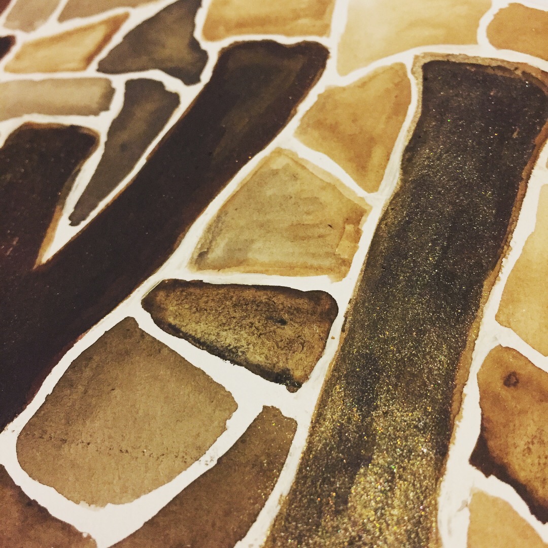
I also love the many different shades of brown and the occasional hint of sparkle created by a bit of fun I had with my Kuretake Gansai Tambi Starry Color paints.
My landscape art journal was perfect for this double page spread where I have demonstrated the importance of this word by the amount of space it takes up. My intention is set and I am really looking forward to the next stage in this project.
Thanks for reading. Until next time,
Steph x x x

No comments:
Post a Comment