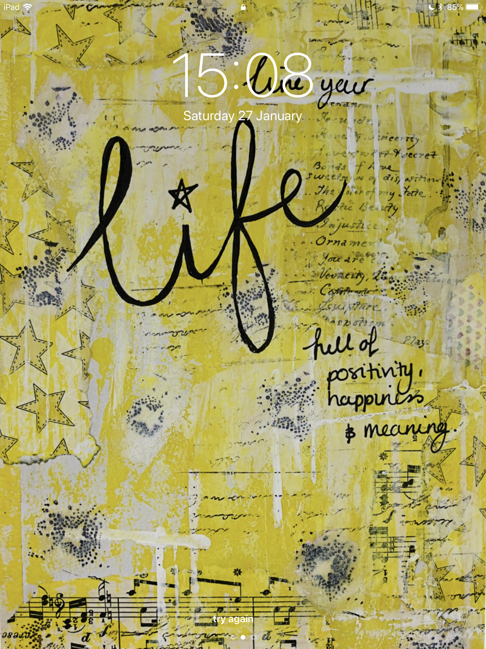
This month I decided to try something a little different with Anna's Patreon artwork. I've had my iPad Pro for a little while as well as the Apple Pencil. So far I've used it for creating some clip art, technical drawing and gaming. The first thing I thought when I saw some of the artwork was that I needed to use it as a digital wallpaper! Some of Anna's artwork is lovely as it is. This is my lock screen on my iPad. Up until this point I was using the screen savers that came with the software. I've used this yellow 'Life' mixed media piece as I find it visually upliting. I love the depth with the different medias used. Everytime I look at it I feel like I see a new piece of it. I play the piano so seeing the sheet music in the background makes me happy.
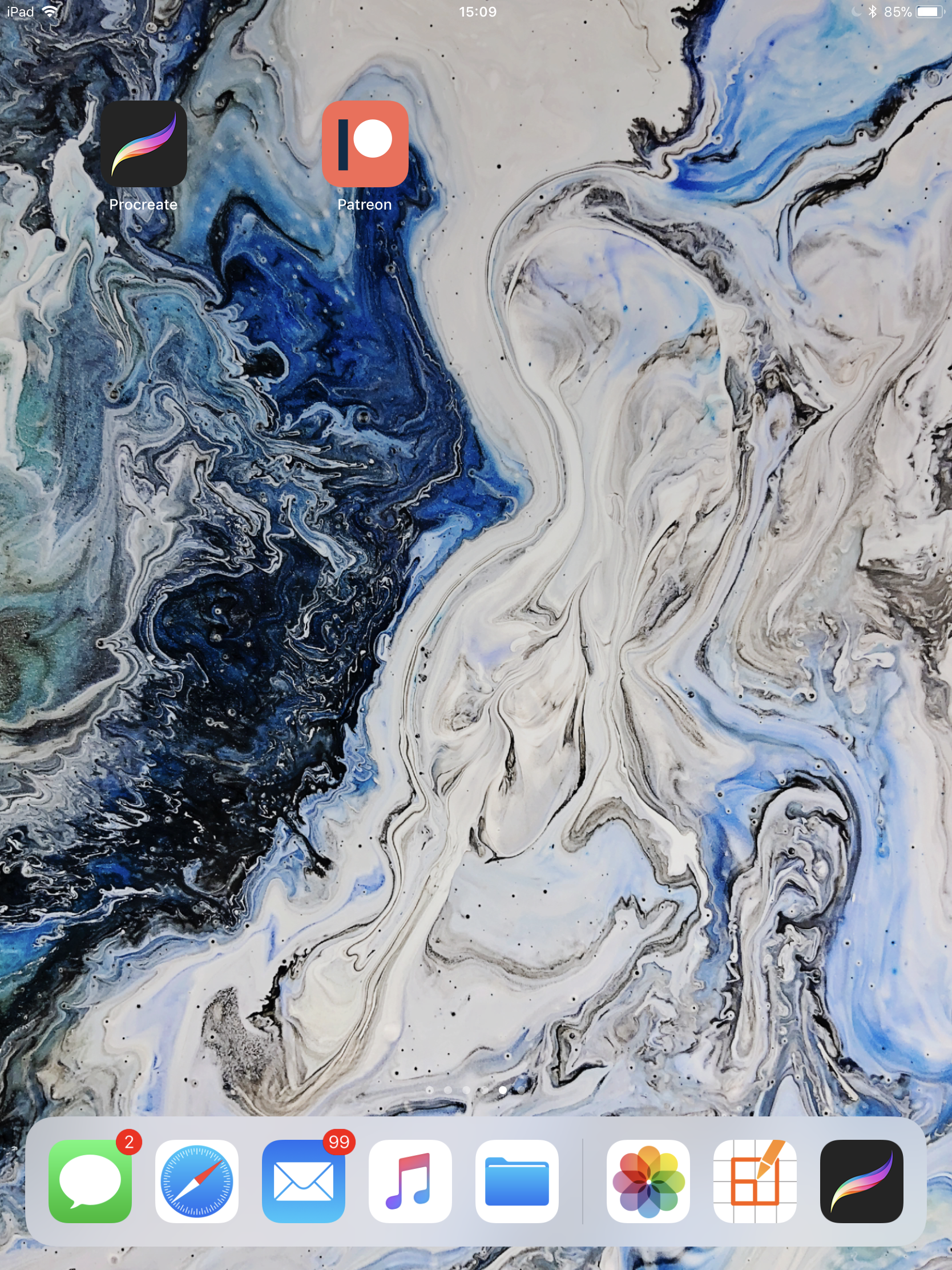
As well as the above piece, I've used Anna's drip style artwork for my home screen wallpaper. I get lost in the swirls and colours. These particular colours, the blues, greys, whites and greens remind me of the ocean. I find them very peaceful.
I then had a play with the artwork in Procreate. This is an app in which I have been creating clip art and sketching but I haven't really created from a mix media perspective. Procreate offers a whole range of brushes with more that can be downloaded. My favourite have to be the artistic brushes. When combined with the Apple Pencil it's so satisfying seeing the textures that can be produced. The pencil is touch sensitive so I can vary the pressue on how the brush reacts on screen.
Don't get me wrong, it will never be the same as actual mixed media play. It's completely different in that sense. It's instant, it's tidy, you can add layers and have different versions, you can take away bits you don't like, you can make multiple versions. However, you cannot feel it, smell it, get the confidence to make a mistake but carry on and make it work. In that sense it's slightly less creative and more technical.
So what did I create?
I was immediately drawn to the black, white and yellow artworks Anna created. Look how nice this start image is...
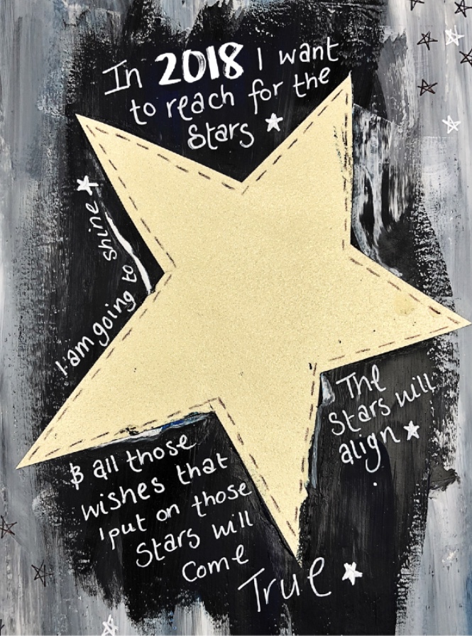
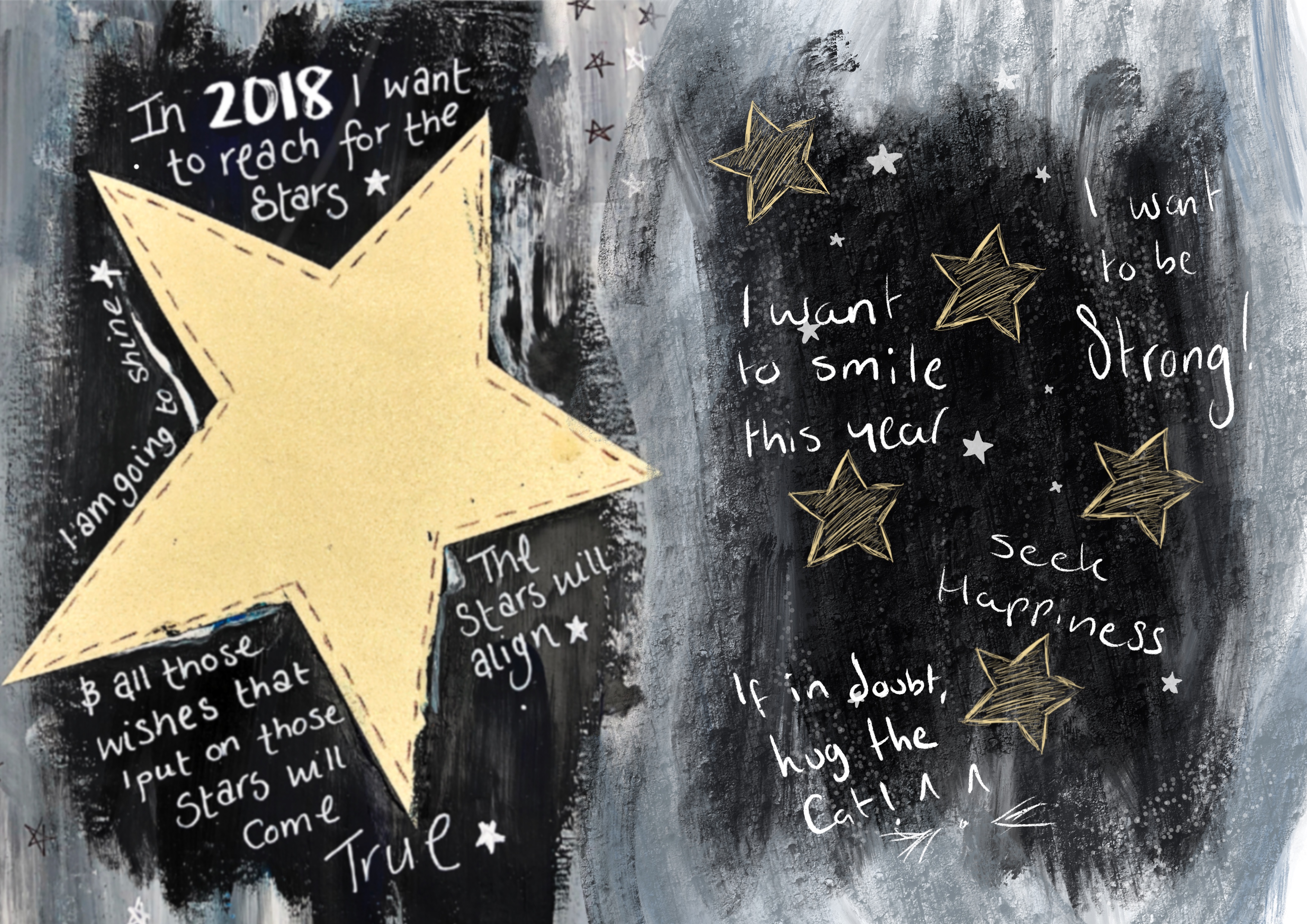
I had to work with it. As I loved how it already looked, I didn't want to create over it. Instead I decided to extend it. This is where I really got a feel for these artistic brushes. I found that they were very similar to the paint style used. This is where layers works well in Procreate as I could build the image up in stages.
Firstly I played with some stars and text....
* Please Pin me on Pinterest * Then I tried an image with stars and a sketchy fairy...
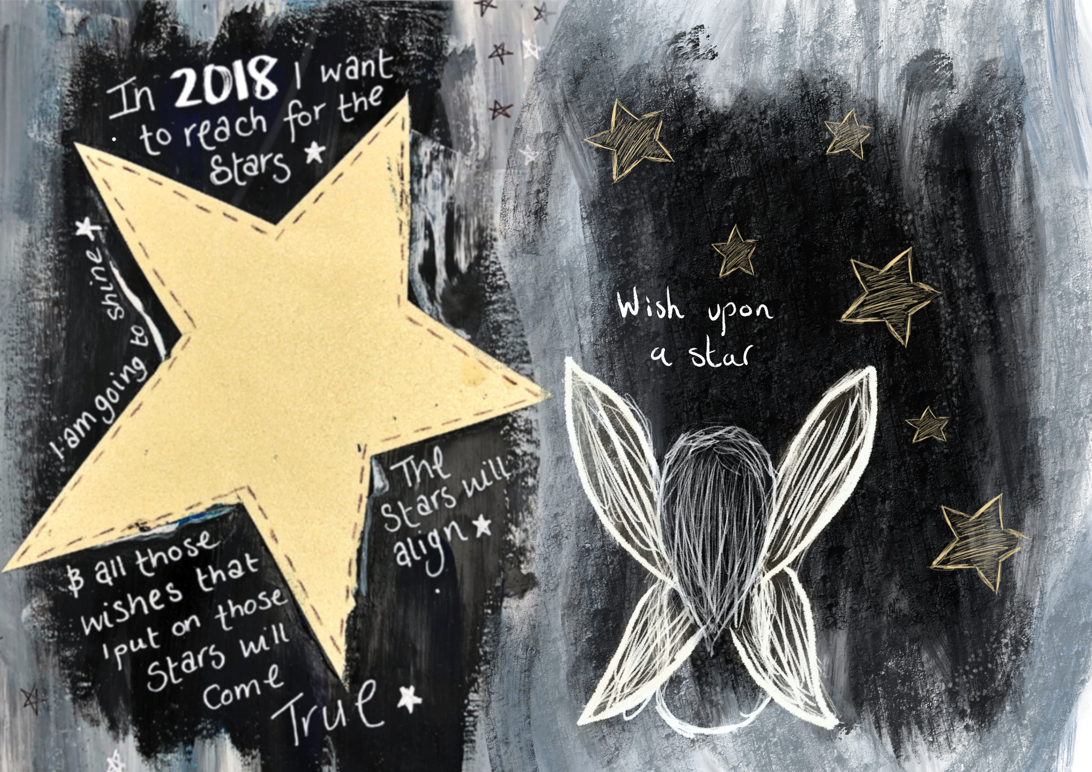
Lastly I decided to combine these images, they were originally two separate artworks. I love how they look together, I used the same brush style technique to blend them into each other. I then added a random little cat drawing, for no reason ^__^
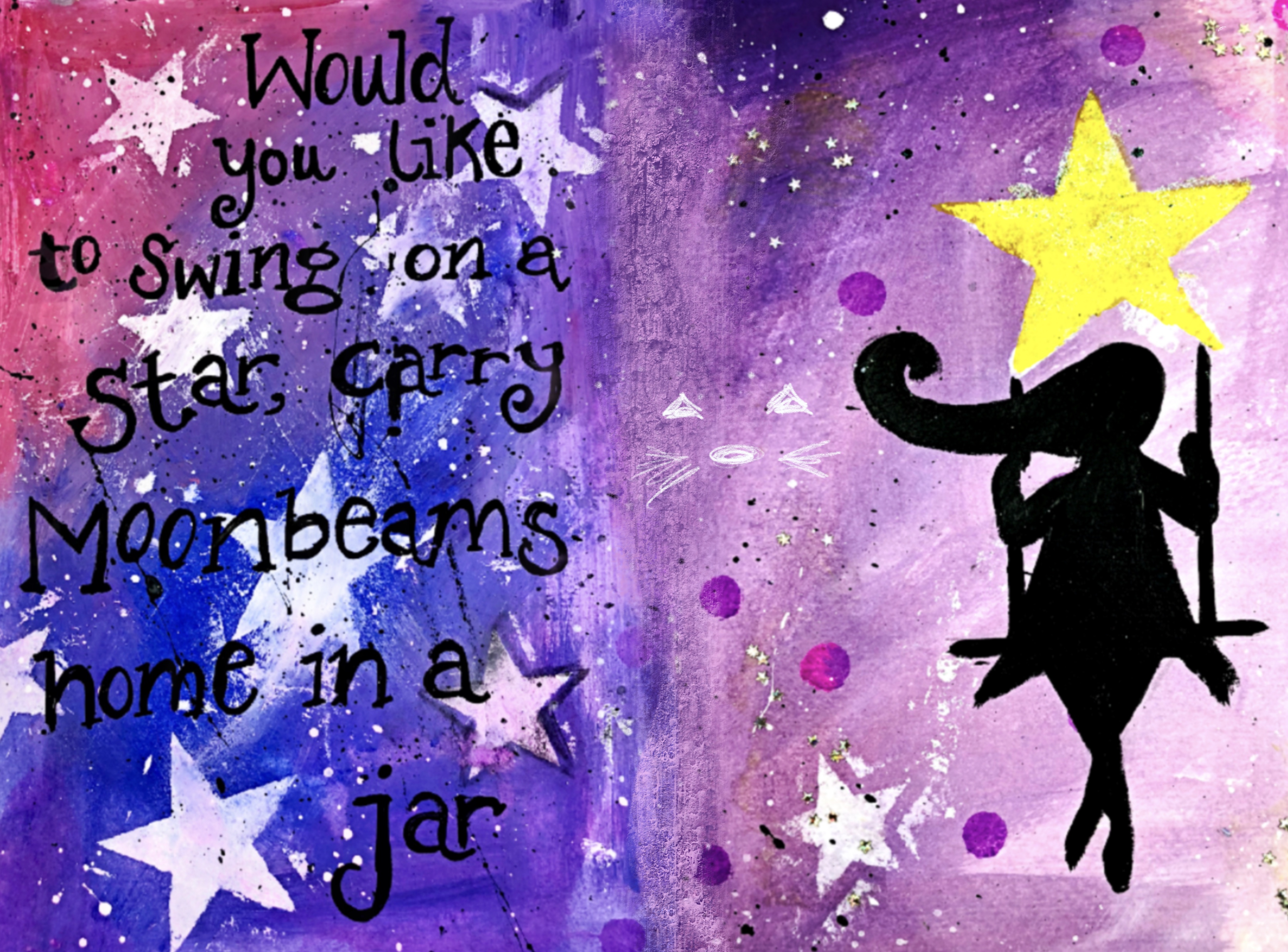
So that's what I've been up to this month. It's a very different way of working, from a journal perspective you don't quite get the same therapeutic feeling you would with a hands on creation. It's never going to be the same as that. It works well if you're wanting to get a feel for some artwork, you can come back to it at different points, add and delete.
Thank you for stopping by,
Kelly xx
Where else you can find me

No comments:
Post a Comment