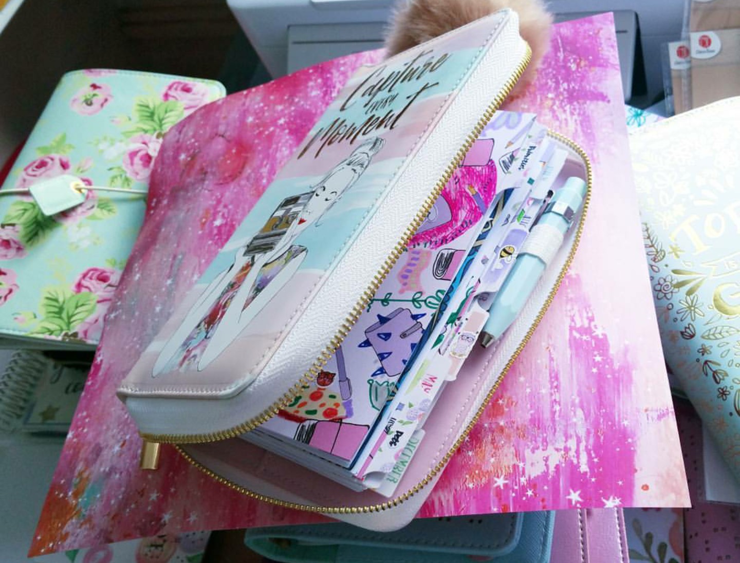
I pimped this month's box heavily... and by 'heavily' I mean I put lots of 'me' into it. I wanted to create a Cambs Planner Con 'vibe.' At least, this is how I hope the next weekend is going to feel like. Lots of planner stuff, happy people enjoying themselves whilst chit chatting about stationairy.
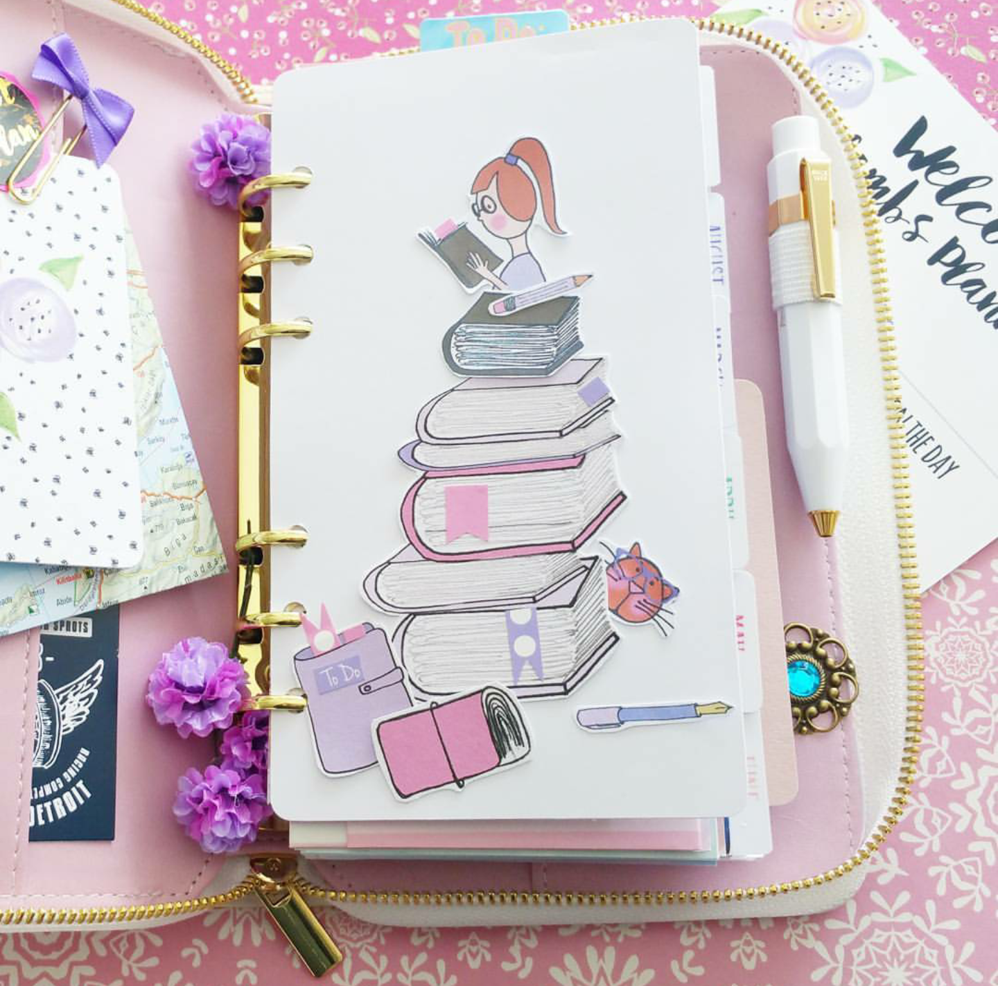
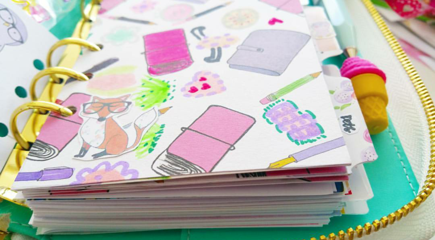
I discovered that trying to create 'ugly' drawings and planner spreads usually turn out into the most unexpected pretty things. I even made up a '#' named 'ugly planning' on instagram, just to see what happens.
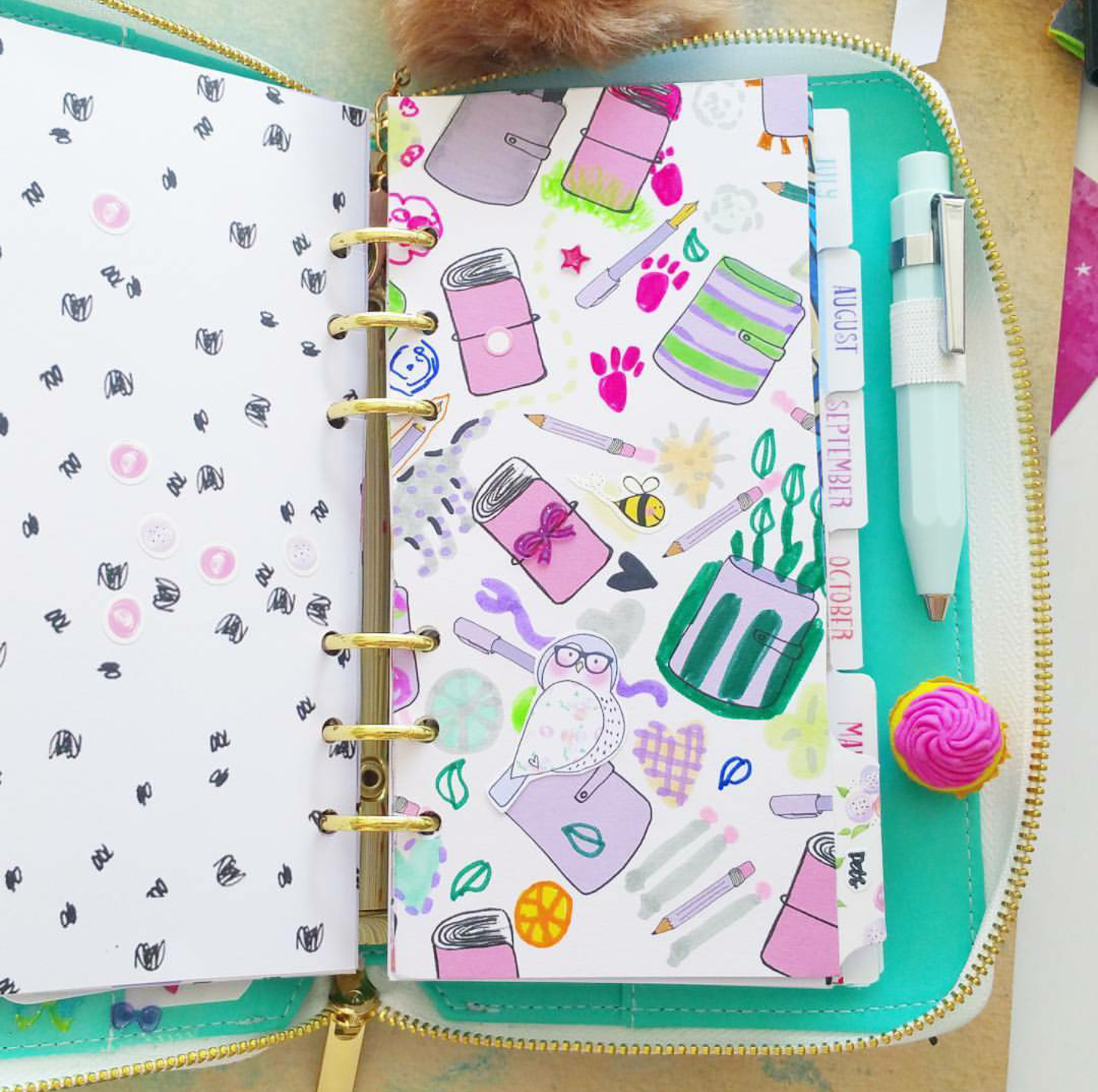
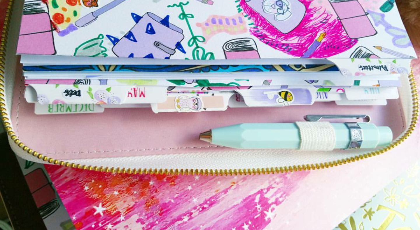
From this month's box I took a 12x12 paper and started using all of my highlighters and felt pens I could find. I honestly didn't have a clue what I started... I just began drawing everything that popped into my mind. variations from abstract shapes to little thingies. At first I thought 'this is going to be a disaster' but I kept on going and filled the whole 12 x 12 page with my own drawings. I felt like a little child again LOL, using Anna's design as a canvas. A canvas doesn't have to be blank at the beginning... it actually helps you start elaborate your drawing.
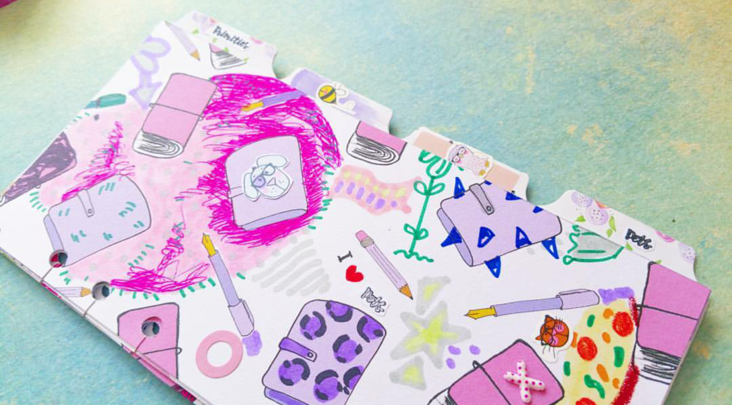
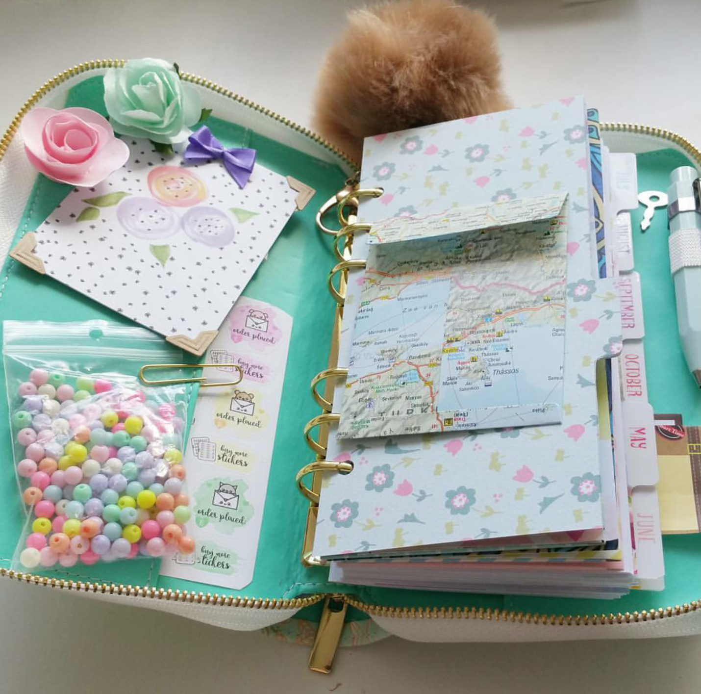
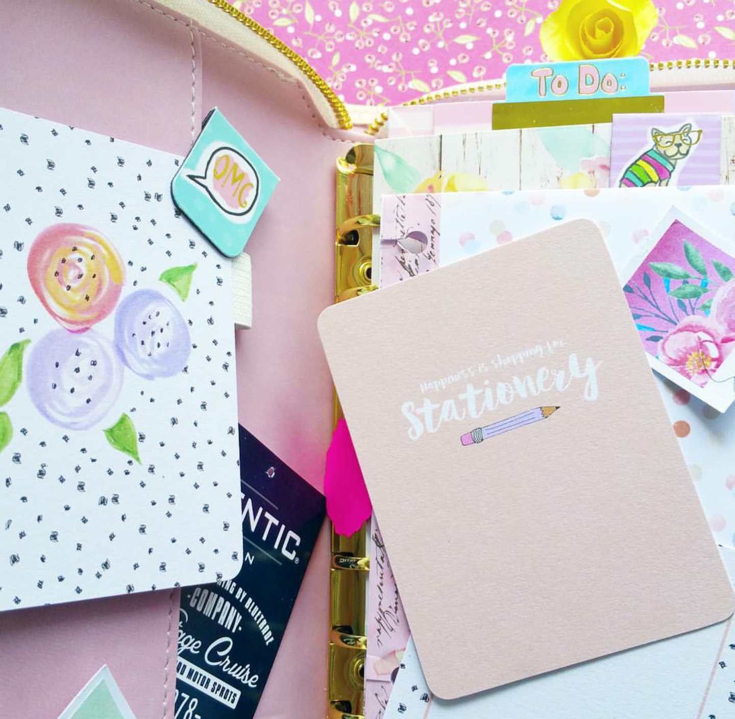
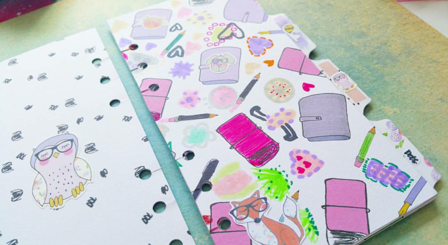
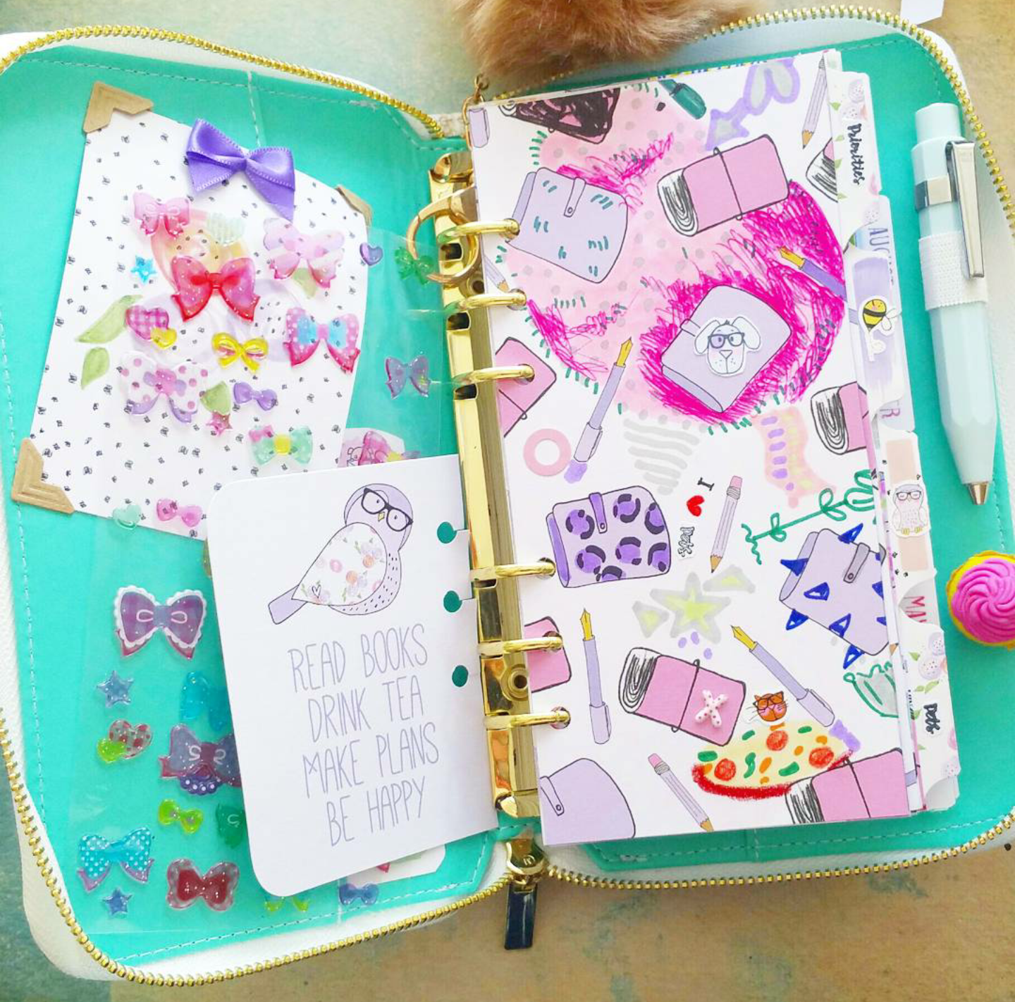
I cut my canvas into dividers and pimped them even more with Anna's tabs. I had four tabs and I had no idea which titels I would stamp onto them since I am not that busy. Then I thought... does tabs really need an importend title? I think not! I love the fact that tabs are just simply in my planner, looking pretty and give some extra dimention. I put some teeny tiny stickers on them. Look at that busy bee :) btw My newest obsession is zipper planners... they remind me of little suitcases... just so darling!
Brigitte


No comments:
Post a Comment