Showing posts with label Kelly. Show all posts

Wednesday, 31 October 2018

I love Autumn, it’s no secret. Using Anna’s artwork to create Autumnal spreads has been a therapy I’ve craved. My life is going through a huge transitional period and being able to sit and create has kept me sane! I usually work with watercolour but decided to get out the acrylics. I’ve been using them more and more recently, I find they give a much brighter and solid finish.


Hello autumn

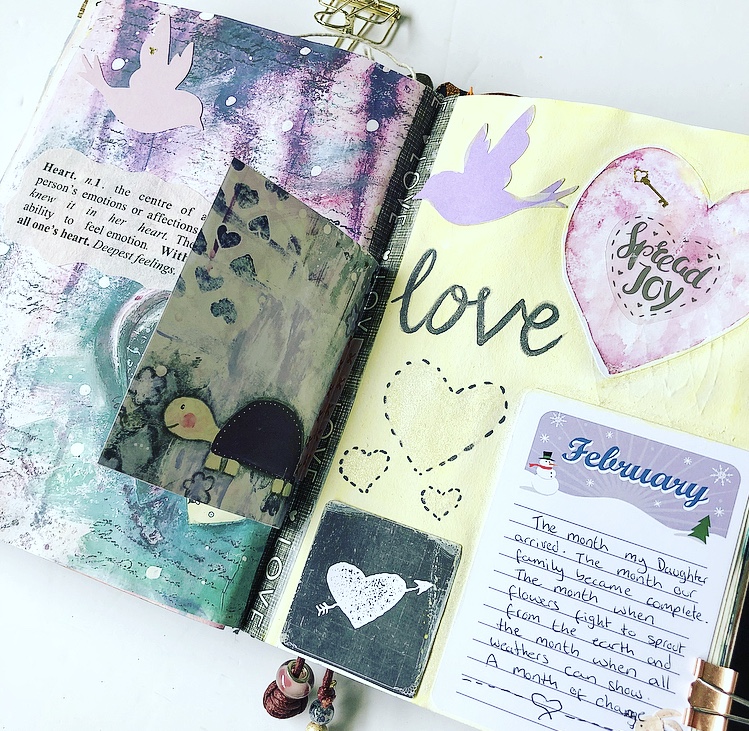
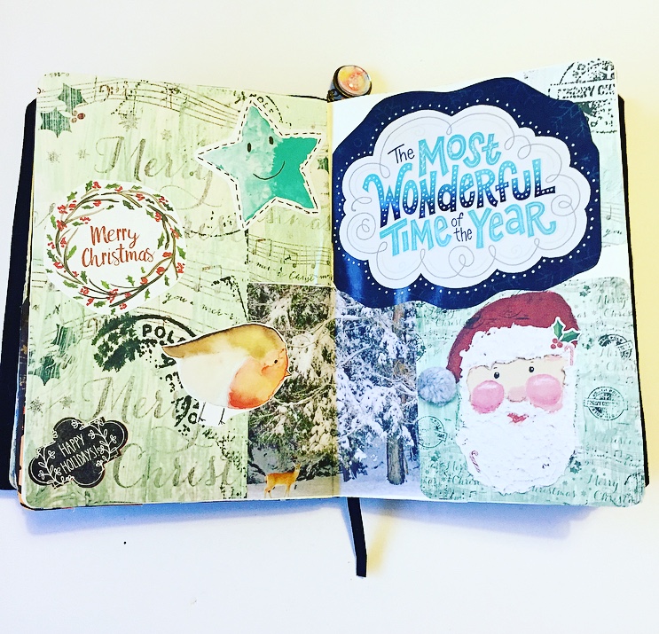
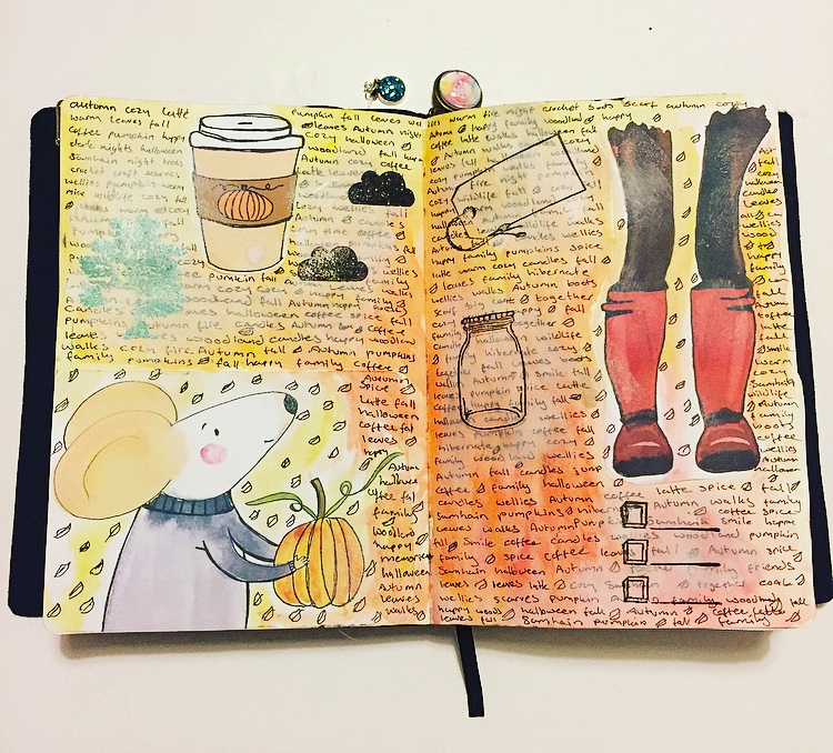
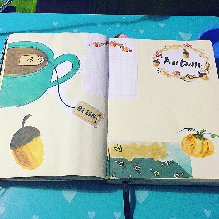
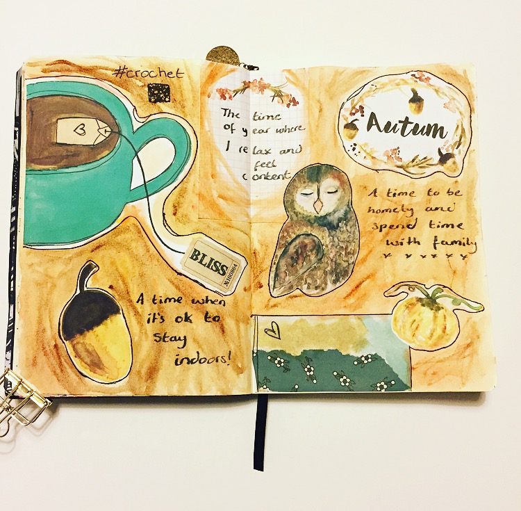
The first spread has an introduction to Autumn and the falling of leaves. In the UK the season is named ‘Autumn’ but as it’s well known, in the US it’s named ‘Fall’. I used to be quite biased and say Autumn was the best name for it however I am beginning to really warm to the word ‘Fall’, it literally makes me picture leaves falling. The past week has been quite blustery in the UK and we’ve finally got big piles of leaves everywhere! Also, how cute is Anna’s little Fox?

  Conkers

I then move onto Conkers! I don’t know what it is but there’s something very exciting about seeing conkers falling to the ground and collecting them. It immediately takes me back to my childhood and running to gather them, bonus points in I found one still in it’s spiky casing! A lot of the other kids would put them on string and have conker fights in the playground, if your opponent smashed your conker you lost. I have a feeling this has now been banned from playgrounds! I never used to play conkers, instead I would hoard my findings like treasure! Now I get to relive it, my Children are mini me’s!

Pumpkin season

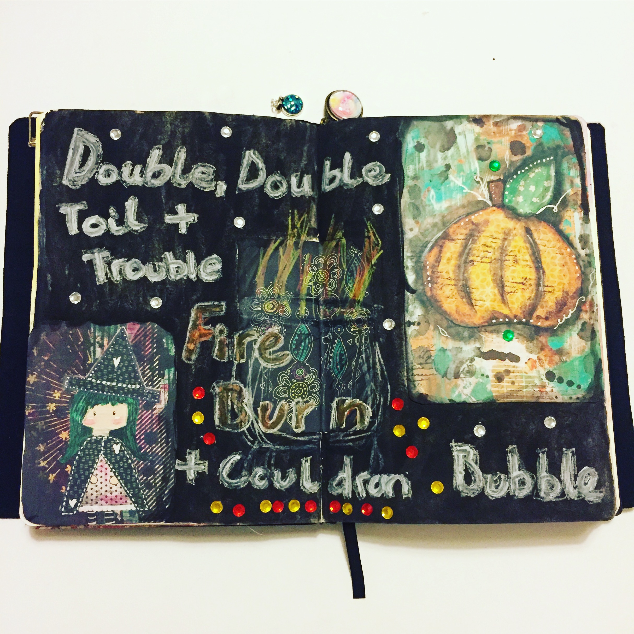
From Conkers to Pumpkins. It wouldn’t be Autumn/Fall without Pumpkins. The majority of the page is taken up by a massive Pumpkin complete with decorative black Cat. I added to this a mouse from Anna’s 2017 Autumnal work. It’s only now as I look back at it that I realise I’ve placed a Cat and Mouse on the same page, a Cat hiding behind a Pumking ready to pounce! I’ve added a recipe journal card from Anna’s Patreon and found a Pumpkin Soup recipe. I may even attempt to cook it...eventually!

  5F8B04B6-C97F-44EB-9AE3-8C3D9D6941C6

My last page is my chill out page. I seem to get a bit rubbish with reading during the Summer, I still do but it slows down. Autumn rolls round and out come the books! I love that the quote mentions “stacks of books (but read on my Kindle!)”. I must admit, as much as I love a real book in my hands, I do tend to read fiction on my Kindle. There’s only a handful of books I will read more than once (fiction that is) so it becomes clutter in my house. The Kindle is a running joke with a group of friends I have, they believe it is blasphemy. With the page itself I have chosen one of my favourite colours and used a pearlescent over the top. I’m not quite finished with the page at this point. I’m still working out how I want to finish it. That’s my most recent up to date artworks. I’m almost finished this sketchbook!

 Kelly xxx

 Where else you can find me: Instagram Youtube Shop


Sunday, 1 July 2018

Why Mrs Brimbles?

I haven’t done a Mrs Brimbles post for a little while. This is because I currently have had so much going on and sitting down to create is few and far between. So instead of showing you what I’ve been up to, as there hasn’t really been a great deal of creativity, I thought instead I would list why I love Mrs Brimbles products. I’m forever starting my posts by saying the products are so easy to work and create with but I never elaborate on this point.


I fully stand by what I say, it’s really easy to get creative with Mrs Brimbles products. I recently attended the EBDUK meet up and Anna had her stall there. The nature of the day was to have a lot of crafting between talks and workshops. It was so nice to have Anna’s stall right there, if I had any inspiration or ideas, I would pop over to the stall and purchase stickers, vellum, scrapbook paper, ephemera, whatever I needed, it was there waiting to be bought and used. So from my point of view, this is why I think Mrs Brimbles products are amazing: Easy to work with The products are very versatile, they can be used for creative journaling, planning, happy mail, pocket letters, art journal work, the list goes on. For me personally, being in a creative journal slump this is where I really appreciate these products. Simply placing different elements on a page will stir my creativity, they’re that easy to work with. The inspiration is right there for you.


Colour schemes and size of artwork

Yey Anna has brought the Brimbles box back! This means you can appreciate a kit that’s been carefully put together. The kits now feature all of Anna’s own artwork. I’ve found that the size of the products works well, the ephemera for example is created to a decent size. Some kits offer small ephemera that can be tricky to use on a creative spread. Anna’s ephemera gets you past the fear of white space and makes it more possible to visually pull a page together. If you’re a mum like me with no time but really want to create, Anna’s work makes this possible.


Unique

 I love how unique Anna’s artwork. It’s Anna’s own style, you can see it’s hers as soon as you look at it. It’s clean and bold. It’s timeless design, I’ve been buying Mrs Brimbles products since 2015 and will continue to do so. The designs from that year are still fresh today.


Always available 

You can still buy Anna’s artwork even after the box month has passed. There are other boxes out there that once the months theme has passed, you can no longer buy that box or the contents. This means there are groups on Facebook where people will post ‘ISO - in search of’ posts. If they are lucky, they will be able to get ahold of that pack of ephemera from March 2017 that they have been desperate for. If they are lucky that pack will remain untouched and it’s contents will be intact. IF they are lucky they won’t have to pay a small fortune for it, higher than what it would have been at the original price and definitely higher than it’s manufacturing price. There is no need for this with Anna’s work, if you see something you like that she has created, there is a good change you can visit her shop and find what you’re looking for, brand new (this excludes the Mrs Brimbles Planners and any other limited edition items). Another point, as this area of accessibility to stock is a huge bonus, is the fact that you can avoid hoarding your stash! I am a typical buyer who will then obsess over how I will use the artwork. I have creation fear, I know that once it’s used in a journal or created into a dashboard in a planner, that’s it. This can sometimes hold me back from using something ‘just in case’. Being able to buy the product again if I want to makes me create, knowing it’s not the only version I can get of this particular item.


Quality and value for money

 All of Anna’s products are made to a high standard whilst being kind to your wallet, you get your money’s worth. Anna is meticulous with how things look and the end product. You can be confident that what you buy will be the best material she can find, the card isn’t flimsy, the sticker paper is good quality, the print is bold and bursting with colour. The artwork alone is a process, Anna works very hard and takes time to choose drawings and designs that she wants people to enjoy working with. So if I’ve swayed you to have a look at some of Mrs Brimbles products, click here to visit the shop and happy creating!

 Kelly xxx

 Where else you can find me: Instagram Youtube Pinterest Facebook


Thursday, 17 May 2018

Raindrops & Rainbows

Hello!

 I’m a little late posting this but I’ve been working with Anna Brim’s Patreon artwork from April. I loved this selection of work because it’s so colourful! I decided to order the April Brimbles box and have included a few bits from there with my pages. In the first spread I’ve experimented with colour. Anna has taken raindrops and instead of having only blue, she has used a full spectrum of colours. I have created tip-ins on this page with journal cards as I love added decoration and layers. When I looked for writing to have on the page, I found a poem named ‘The Rainbow Witch’ by Amy Ludwig Vanderwater. It’s a short poem that doesn’t take itself seriously, a playful prose for the page.

  E9C76D1A-60EC-4869-87EB-B22FF36D85E707BA6B1F-F470-48B6-9A7F-FEED17F3456F
3572737D-A9E8-4EE6-BD31-6F7D3C9422CA
The second spread in contrast to the bright rainbow page is much darker. I’ve used purples and greens on this page. Purple a very spiritual, powerful colour so it felt right for the page. I decided to work with a journal prompt on this page with a bit of self exploration. Using a the book ‘The Year of You’ by Hannah Braime, I chose the prompt, “What is one quality you embody today that you hope to keep for the rest of your life?”. I then did a bit of soul searching and answered this prompt across the page.
  4F7F4611-D968-4295-8EEB-C82BE7BCCC45D1F490DE-19AB-4C48-B290-73D207D0AD8C

The third spread wasn’t actually planned and came by playing with the artwork. I knew I wanted to use these elements but wasn’t sure how. So in true style for me I arranged them on the pages and allowed my creative nature to run free. These pages had already had some blue paint spillages on the edge so I decided to work with it and I quite like how it’s turned out.

  65864EE7-6C25-4B4C-827F-46E542B0E0428AB262A5-278C-4231-995C-ADA035B8DD05

That’s all from me for now,
 Kelly xxx

 Where else you can find me: The Scrapbook Girl Instagram Pinterest Youtube


Tuesday, 3 April 2018

Shine Bright Art Journal Page

Using the tutorial by Anna on her Patreon, I had a go at the Galaxy Painting using the layered watercolour wet media technique. I chose to work with a mixture of purples and blues. I started off making sure my pages were completely wet and gently placed the brush in random spots. The wetness allowed the paint to bleed onto the page. The process itself was very relaxing as you had to work slowly.
  94CEBAF3-407D-4E00-967F-1EE6B09DC736

Typically as I have a busy home life, I had to set the page aside and come back to it. The benefit of this was that I was able to create a little bit of art during a particularly busy week. When I returned to the artwork, I quickly wet the page again. I actually did this at speed with a large brush, however I would be tempted to try a wet spray bottle to see what outcome that would give.

  4B417E1A-A56B-4A4F-9810-F507FCCF58E6
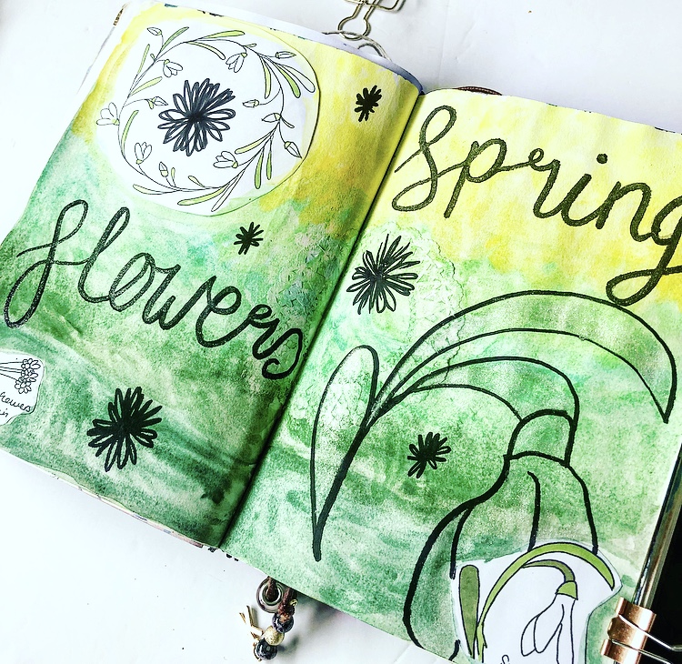
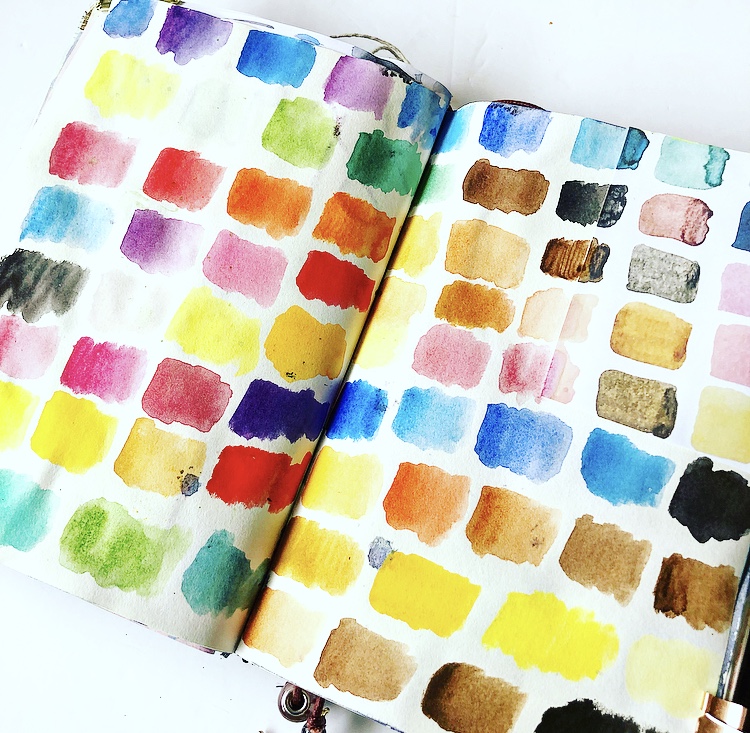
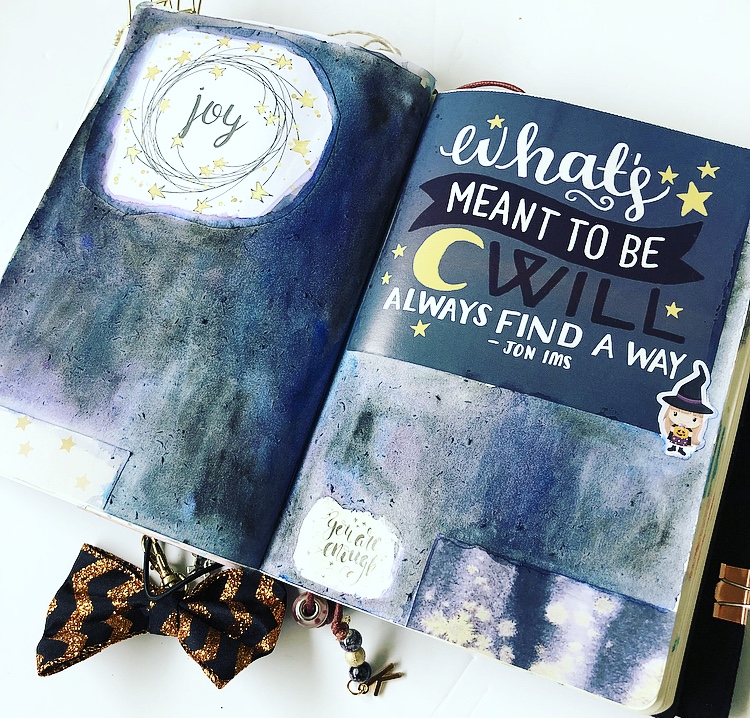
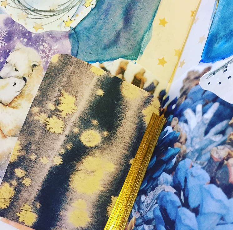
I then began the same process of adding colour and allowing it to dry. This process was completed around five times. As I got higher up in my watercolour layers, I started to add lighter colours to give some depth to the page.
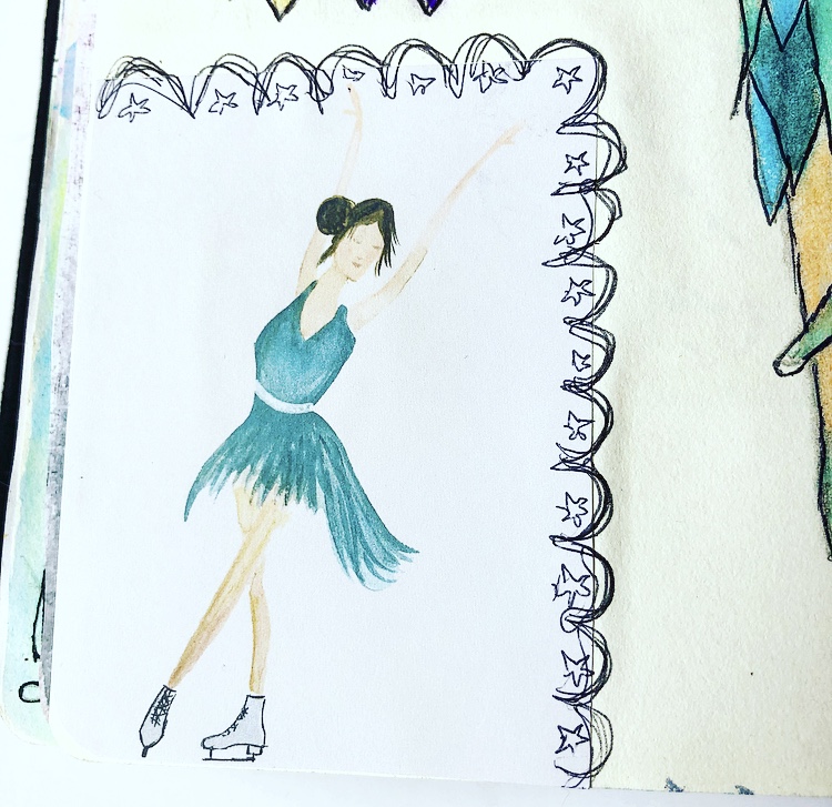
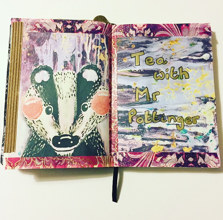
  68373AB6-25BF-4011-B515-DED1E6437CC8

Once dry I loved being able to see the paint layers at the edge of the painting as well as the separate tones throughout the page. To finish it, I added the words ‘shine bright’ with a gold brush pen as well as a shimmer brush pen. I also added a few stickers from Little Rainbow Moon.

A3F87F1C-31EA-4BB6-A492-2108128E691AI

f you’re interested in watercolour and other painting/art techniques, check out Anna’s Patreon here

Thank you for stopping by, Kelly

 Where else you can find me The Scrapbook Girl Instagram Pinterest Youtube

Saturday, 24 February 2018

Pages in my journal

Again we have been spoilt with the artwork given via Anna's Patreon. I've managed to create four completed spreads, all with a different theme. The first spread used a lot of Anna's mixed media as they had a Feburary Love feel. I love the colour scheme used, it's not your expected pinks and reds but instead uses blues, pale pinks, purples and a complementary lemon colour. I recently posted about the Crafty Bonbons box, I used a few pieces from here with it being a box of the same theme.

  IMG_0496

I used a February journal card to say what I love about the month and decorated the page around it. I even got to practice some more brush lettering!
  IMG_0495

The second page has been inspired by the Snowdrop doodles. I wanted to use the same colours used in the flower swirl design (on the left) and keep the page fairly simple.
  IMG_0501

I wanted it to have a fresh, happy spring feel. Again more brush lettering has been practiced and I've used a glittery clear brush pen over the black.

  IMG_0500

The third page is inspired by the Ice Skating Dancers.

  IMG_0497

I used to attend adult Ballet classes and loved the positions of the drawings. The feel of the drawings made me think of flower sprits so I decided to sketch and combine this with Ballet.

  IMG_0499

I played with dresses to give them a look of petals at the bottom. I also decided to draw a closeup of a pointe ballet pump, this isn't a stage I managed to achieve due to falling pregnant whilst learning, however it's something that one day I would love to re-visit and work up to.

  IMG_0498

The fouth page is a swatch page. I have been wanting to do this for ages but it's one of those things that have been on my list that I'd never gotten round to. Seeing Anna's mini swatch square prompted me to have a go. I tried to extend the swatches at the end of the mini swatch and after that it was a free for all!
  IMG_0502

Lastly I have actually begun a fifth spread. This is using some of Anna's previous artworks and a quote from my 2017 calendar. I'm not sure how I will finish it but I'm loving how it's looking so far.

  IMG_0503

Thanks for stopping by,
 Kelly.

 Where else you can find me The Scrapbook Girl Instagram Pinterest Youtube


Thursday, 15 February 2018

A different way of working

Hello!

This month I decided to try something a little different with Anna's Patreon artwork. I've had my iPad Pro for a little while as well as the Apple Pencil. So far I've used it for creating some clip art, technical drawing and gaming. The first thing I thought when I saw some of the artwork was that I needed to use it as a digital wallpaper! Some of Anna's artwork is lovely as it is. This is my lock screen on my iPad. Up until this point I was using the screen savers that came with the software. I've used this yellow 'Life' mixed media piece as I find it visually upliting. I love the depth with the different medias used. Everytime I look at it I feel like I see a new piece of it. I play the piano so seeing the sheet music in the background makes me happy.

  IMG_0138.PNG

As well as the above piece, I've used Anna's drip style artwork for my home screen wallpaper. I get lost in the swirls and colours. These particular colours, the blues, greys, whites and greens remind me of the ocean. I find them very peaceful.

  IMG_0139.PNG

I then had a play with the artwork in Procreate. This is an app in which I have been creating clip art and sketching but I haven't really created from a mix media perspective. Procreate offers a whole range of brushes with more that can be downloaded. My favourite have to be the artistic brushes. When combined with the Apple Pencil it's so satisfying seeing the textures that can be produced. The pencil is touch sensitive so I can vary the pressue on how the brush reacts on screen. Don't get me wrong, it will never be the same as actual mixed media play. It's completely different in that sense. It's instant, it's tidy, you can add layers and have different versions, you can take away bits you don't like, you can make multiple versions. However, you cannot feel it, smell it, get the confidence to make a mistake but carry on and make it work. In that sense it's slightly less creative and more technical. So what did I create? I was immediately drawn to the black, white and yellow artworks Anna created. Look how nice this start image is...
  IMG_0052

I had to work with it. As I loved how it already looked, I didn't want to create over it. Instead I decided to extend it. This is where I really got a feel for these artistic brushes. I found that they were very similar to the paint style used. This is where layers works well in Procreate as I could build the image up in stages. Firstly I played with some stars and text.... 

IMG_0145 

* Please Pin me on Pinterest * Then I tried an image with stars and a sketchy fairy... 
IMG_0144 

Lastly I decided to combine these images, they were originally two separate artworks. I love how they look together, I used the same brush style technique to blend them into each other. I then added a random little cat drawing, for no reason ^__^ 

IMG_0143

So that's what I've been up to this month. It's a very different way of working, from a journal perspective you don't quite get the same therapeutic feeling you would with a hands on creation. It's never going to be the same as that. It works well if you're wanting to get a feel for some artwork, you can come back to it at different points, add and delete. 

 Thank you for stopping by, 
 Kelly xx 
 Where else you can find me 

Tuesday, 19 December 2017

Yule Art Journal

I'm back with some of Anna Brim's Patreon artwork. This month I've been playing with the December artwork. There's a really nice mix of themes for this month, cute, abstract and a bit more technical. It meant I could try out a few different things. As usual I decided to create a journal spread, which quickly became two. I didn't have a plan at all, I had a few choice craft items, Anna's printed artwork and a Daphne's Diary magazine. The first piece of artwork that drew my eye was the mixed media Santa. I love the different textures used, especially the fluffy pom pom at the end of his hat!

  IMG_5809

I had to pair this up with the green mixed media scrapbook paper design. This was the foundation of the page. Coincidentally, the same day my quote a day calendar happened to have 'The most wonderful time of the year' featured so it had to be added to the spread. I lined this up with the cute star, the colours and playful font matched well with the dotted line around the star.

  IMG_5810

I'd been flipping though the Daphne's diary and one of the features showed a Forest image with wild Deer. It had been snowing the same weekend of creating this, everywhere except where I lived! So I brought the snow to my artwork. The Robin fitted well with this, I like the miss-match in proportion, the tiny Forest and Deer and giant Robin!

  IMG_5808.jpg

Lastly I finished the page with Anna's 'Merry Christmas' wreath with tradtitional festive colours complimenting the scrapbook paper behind it. As a final addition, for no reason at all, I added a black and white sticker from Daphne's diary in the bottom left corner. I then, as I was in the flow, decided to create another spread. I had to use Anna's Stag, it was originally designed to be a Christmas card (something that will come in handy as I haven't bought one for my works Secret Santa!). I'd seen a lovely Pinecone layout in the magazine with white, gold and blue. I had to pair it with the Stag, the rich colours of both fitted so well together.

  IMG_5805.jpg

Next I needed to pull the page together. I knew I wanted to use the star swirls, again no plan but was determined to put them on the page. After flipping through the magazine for a little while, I found a lovely image of some cuddling Polar Bear. I added this to the page and put the star swirl above it, it's actually ended up looking a bit like a full moon!

  IMG_5807

I finished of this main bit of the page with another small swirl, a border from a page in the magazine as a central point and stripey gold shimmer washi to compliment the Stag's crown. I used a mixture of blue and purple watercolour to fill in the gaps. The page didn't quite feel finished and I had some journal card sized artwork. One of which is a Spiritual Woman/Deer, at least that's how I see her. I backed this with some more mixed media artwork, beautiful purples/blues with yellow/white spoldges, almost looking like fireflies. I used the same washi to create a tip-in centrally on the page.

  IMG_5806

I'm so pleased with how these pages turned out, I felt so festive creating them!
 Thank you for stopping by, Kelly.

 Where else you can find me:
https://www.youtube.com/channel/UCoUNZVBg0Qe8n0Y87Sb4u6w https://www.instagram.com/the_scrapbook_girl/
https://www.etsy.com/uk/shop/TheScrapbookGirlShop


Thursday, 2 November 2017

Kelly's Autumn & Halloween Journal Pages


This month on Anna's Patreon we have been spoilt again with beautiful artwork. We have been given a mixture of abstract mixed media and Anna's signature sketches. I carefully selected and printed the pieces that stood out to me. I never really know where I'm going to go with the artwork or what I will create. Instead I group imagery together and place it on the page. Then I add paints/pencils and slowly I begin to piece something together.

  IMG_5581

The first spread I created has a Halloween/Witchy feel. It had to be done! It's the month of Samhain! I love the Pumpkin that Anna has created, the page started with this. I then added the cute little Witch in the opposite corner and the black floral pattern to the centre. Then the quote "Double, double, toil and trouble, fire burn and Cauldron bubble" popped into my head. With this in mind I painted the whole spread black. I decided to outline a Cauldron sketch in the centre of the page over the flowers. The quote is written in large letters over the whole page, I had to use several different medias to get this text to appear! Lastly I've added little stick on gems I recently received in a swap.
  IMG_5579

The second spread I created has an Autumnal feel. It was easy to create with Anna's artwork, as soon as I laid the images down I was getting ideas popping into my head. I had to use the Mouse as it is so cute! I love the Coffee cup with the Pumpkin and the Wellington Boots, so on they went! I then picked out a watercolour palette to match the page. I wanted to add something a little different so wrote words that remind me of Autumn repeatedly over the pages with little leaves between them and surrounding the images. To finish the pages I used a small amount of white Acrylic brushed on with a sponge and some stamps. The clouds, jar and tick boxes are from previous Brimbles boxes. I like that these are currently 'empty' so that I can add journal words later should I want to.

  IMG_5578

The third spread takes a different turn. Without going into specifics, I've had a few difficult weeks recently, it's been challenging. I saw the drawing of what looks like to me a sad character. She basically in that image showed how I'd been feeling. I paired this up with the flowers on the dark background and on the far right the Sunflower which I teamed up with more Wellington Boots. I created a background to show change, the gloomy colours on the left and brighter on the right. The word 'Grow' has been placed in the centre to show that this page reminds me that I can rise above bad situations. I have written some journal entries around the page in reflection to the time and as a reminder that I am strong. That's my three journal spreads for this month, thank you for stopping by, Kelly. Where else you can find me: Blog YouTube Instagram Etsy

Monday, 25 September 2017

Autumn art journal pages


I have loved the artwork Anna has given us this month. The style is very much aimed towards Autumn, yey! I decided to create two spreads, it took me a while to work out what I wanted to do. I always look forward to seeing Anna's mixed media work, this month featured one of my favourite colours, purple! It has depth, there's splashes of gold to give it a rich feel and it HAD to go into my art journal. I teamed this page with a similar background featuring a Badger painted at the front. I've looked closely at the Badger and love how Anna has used different textures in the facial area. Once I had these stuck down, I remembered I had some Recollections washi tape that would match perfectly. I wanted to finish the page but not use washi that would distract the eye. At this point, I didn't really know what to do. I didn't want to add too much more as I liked it how it was. However I need pages to have meaning, although the page looked lovely, it had to soul. So I had it open on my desk for a good week. After a while I started to recognise the Badger as a character. He began to have personality. I've now come to the point where I would love to write a Children's story based on the Badger. This sparked the title on the opposite page of 'Tea with Mr Pottinger". I have the story in my head, or at least the bones of it and that is where it will stay until I get it on paper.

  FullSizeRender (43)

I then created a second spread. There were so many beautiful elements, I needed to use them! I decided to create a spread dedicated to Autumn and being cosy. Anna's large half mug of tea became the focal point and everything else worked around this.
  IMG_5386

I used watercolours to create a movement background, to feel like leaves in Autumn. I then added little messages about what I love at this time of year.
  FullSizeRender (42)

Happy Autumn! Kelly xxx Where else you can find me: YouTube Instagram Pinterest Twitter